We design and develop custom Power BI dashboards that transform raw data into actionable insights. Our service includes end-to-end dashboard creation—from data integration and modeling to KPI definition, visualization design, and deployment. Each dashboard is tailored to business objectives, enabling real-time performance tracking, trend analysis, and decision-making support across financial, operational, and strategic domains. We ensure clean data structures, interactive reporting, and mobile-friendly access, following industry best practices for governance, scalability, and security.
The service encompasses:
✅ Data Source Assesment :To identify, evaluate, and prepare all relevant data sources required to support the dashboard's KPIs and visual reporting needs, ensuring compatibility, reliability, and scalability.
✅ KPI Roadmap : the key performance indicators that align with business objectives and drive dashboard development. It involves identifying critical metrics, mapping them to data sources, and establishing calculation logic using DAX in Power BI.
✅ Dashboard Development Assessment: Understanding business objectives, key metrics, and reporting needs; identifying target users and their specific data visualization requirements; assessing data sources, integration points, and technical environment.
✅ Custom Power BI Dashboard Development: Integrating data from multiple sources for real-time insights; creating interactive and visually engaging dashboards using Power BI’s advanced features; optimizing performance to handle large datasets seamlessly.
✅ Training & Support: Providing hands-on training to ensure effective dashboard management and utilization; offering ongoing support for updates, troubleshooting, and scalability at $150/hour.
Utilizing our Power BI Dashboard Development Services offers several benefits :
✅ Improved Decision Making: Dashboards provide real-time, visual insights that support data-driven decision-making.
✅ Data Accessibility: Dashboards consolidate data from multiple sources into one view, making it easier to access and analyze information.
✅ Performance Monitoring: They enable stakeholders to continuously monitor performance across various business metrics, ensuring alignment with objectives.
✅ Powerful Data Integration: The service offers robust data integration capabilities, enabling users to connect to a wide variety of data sources effortlessly.
✅ Enhanced Strategic Decisions: Gain actionable insights with user-friendly, data-driven visualizations and enhance strategic decisions with real-time, interactive reporting.
Timeline : 1 Week
Scope & Features :
Limited data sources
Few KPIs
Basic layout and visuals
Upto 10 Hrs Support
Quick setup & delivery
What Includes :
✅ Data Source Assessment – Identify single source (Excel/CSV)
✅ KPI Roadmap – Collaborate with the business owner to define 3–5 core KPIs .
✅ Data Cleansing – Perform basic data cleaning using Power Query (nulls, filters)
✅ Modeling – Set up basic calculated columns or DAX measures
✅ Report Design – Create basic visuals and maintain a clear layout
For any specific questions or Doubts ,
Timeline : 2 – 3 Weeks
Scope & Features :
• Multiple data sources (SQL, CRM, APIs)
• Different user roles
• Custom visualizations
• Security & training
What Includes :
✅ Data Source Assessment – Connect to multiple structured sources
✅ KPI Roadmap – Define KPIs by department/user role
✅ Data Cleansing – Apply Power Query transformations
✅ Modelling – Create star schema with relationships
✅ Report Design – Role-based dashboards, bookmarks, drill-throughs.
For any specific questions or Doubts ,
Timeline : 4 – 6 Weeks
Scope & Features :
• Complex data logic
• Advanced DAX
• Interactive reports
• Lifecycle support (design to onboarding)
What Includes :
✅ Data Source Assessment – Multiple enterprise systems (ERP, APIs, Data Lakes)
✅ KPI Roadmap – Executive, departmental, operational KPIs
✅ Data Cleansing – Automated pipelines, data validation
✅ Modelling – Aggregated fact tables, calculated columns/measures
✅ Report Design – Interactive UI/UX with dynamic visuals, tooltips, RLS, custom themes
For any specific questions or Doubts ,
Requirement Gathering :
✅ Identify Reporting Needs: Engage stakeholders to collect specific insights and business questions they want answered through the dashboards.
✅ Define Data Sources: Confirm the systems from which data will be pulled, such as: Google Sheets , ERP , SharePoint , Outlook , Excel .
✅ Understand Dashboard Objectives: Clarify what success looks like — e.g., operational visibility, sales performance, HR attrition analysis, etc.
Data Flow & System Architecture :
✅ Establish Data Connection Strategies: Design how Power BI will connect to each data source (via API, ODBC, DirectQuery, or import).
✅ Document Dependencies & Security: Capturing any integration, authentication, and security considerations (like data access levels, RLS).
Prototype & Initial Visualization :
✅ Mock-up Designs of Dashboards: Creating initial wireframes or sketches of the dashboard layout — defining the structure and placement of visuals, filters, and KPIs.
Sprint 1 :
Deliver First Working Dashboard: A functional version of the dashboard is developed based on planning outcomes, including connected data, basic visuals, and core KPIs.
Sprint 2+:
Deliver Additional Dashboards: In every subsequent sprint (bi-weekly), new dashboards or enhancements are delivered incrementally based on evolving requirements.
Continuous Feedback: Adjust Based on Input: Stakeholders review the outputs of each sprint and provide feedback. Dashboards are adjusted and optimized to better meet expectations.
✅ We Will develop one report / dashboard for a specific process , The efforts would be negligible ( less than 2 weeks / 30 hrs ) .
✅ We will develop one KPI group or one project or one process – well defined and accessible data source being the prerequisite.
By industry
Ideal for PMOs and investment managers, this dashboard tracks the performance of multiple projects or portfolios. It consolidates project health, financials, and timelines to enable strategic oversight.
Major KPIs and metrics covered in the Portfolio Management dashboard are:
Portfolio Value
Project Count
Cost Variance
Timeline Variance
Milestone Status
Resource Allocation
Risk & Issue Summary
Governance Status
The financial dashboard helps to enhance the strategical as well as analytical efforts related to major financial aspects of your organization.
Major KPIs and metrics covered in the Financial dashboard are:
Gross profit
Revenue
Operating profit
Net profit
Operating expense
Operating cash flow
Working capital components
Key balance sheet indicators
The risk management dashboard is built for compliance officers and risk teams to monitor key exposures, controls, and event trends. It provides centralized insights to support enterprise risk assessment and mitigation planning.
Major KPIs and metrics covered in the Risk Management dashboard are:
Risk Heatmap
Open vs. Closed Risks
Risk Category Analysis
Key Risk Indicators (KRIs)
Control Effectiveness
Incident Frequency
Risk Ownership
Residual Risk Score
The project management dashboard consolidates task progress, cost control, and milestone tracking. It supports project leads in monitoring performance against plan and resource allocation efficiency.
Major KPIs and metrics covered in the Project Management dashboard are:
Project Status
Budget vs. Actual
Timeline Adherence
Resource Utilization
Issue Tracking
Milestone Achievement
Earned Value Metrics
Risk Level
The education dashboard is designed for school administrators and education boards to monitor academic performance, student engagement, and faculty workload. It centralizes performance metrics for strategic academic planning.
Major KPIs and metrics covered in the Education industry dashboard are:
Enrollment Count
Attendance Rate
Dropout Rate
Student Performance
Faculty Load
Graduation Rate
Subject-wise Performance
Extracurricular Participation
This dashboard empowers HR leaders to monitor workforce performance, talent acquisition, and employee engagement. It visualizes critical HR KPIs to drive strategic workforce planning, enhance employee satisfaction, and ensure organizational compliance and productivity.
Major KPIs and metrics covered in the HR Management dashboard are:
Employee Turnover Rate
Time to Hire
Absenteeism Rate
Training Hours per Employee
Employee Engagement Score
Internal Mobility Rate
Diversity Ratio
HR-to-Employee Ratio
This dashboard provides real-time visibility into sales performance, revenue generation, and customer acquisition efficiency. It consolidates critical sales KPIs into a single, interactive view, enabling leadership to forecast growth trends, optimize sales strategies, and identify high-impact opportunities. The dashboard empowers decision-makers to drive sustainable revenue expansion, improve sales productivity, and align sales operations with broader business objectives.
Major KPIs and metrics covered in the Sales dashboard are:
Total Sales Revenue
Sales Growth Rate (%)
Target vs. Actual Sales Achievement
Average Deal Size
Win Rate (%)
Lead Conversion Rate
Customer Acquisition Cost (CAC)
Sales Cycle Duration
Customer Retention Rate
Regional and Product Segment Performance
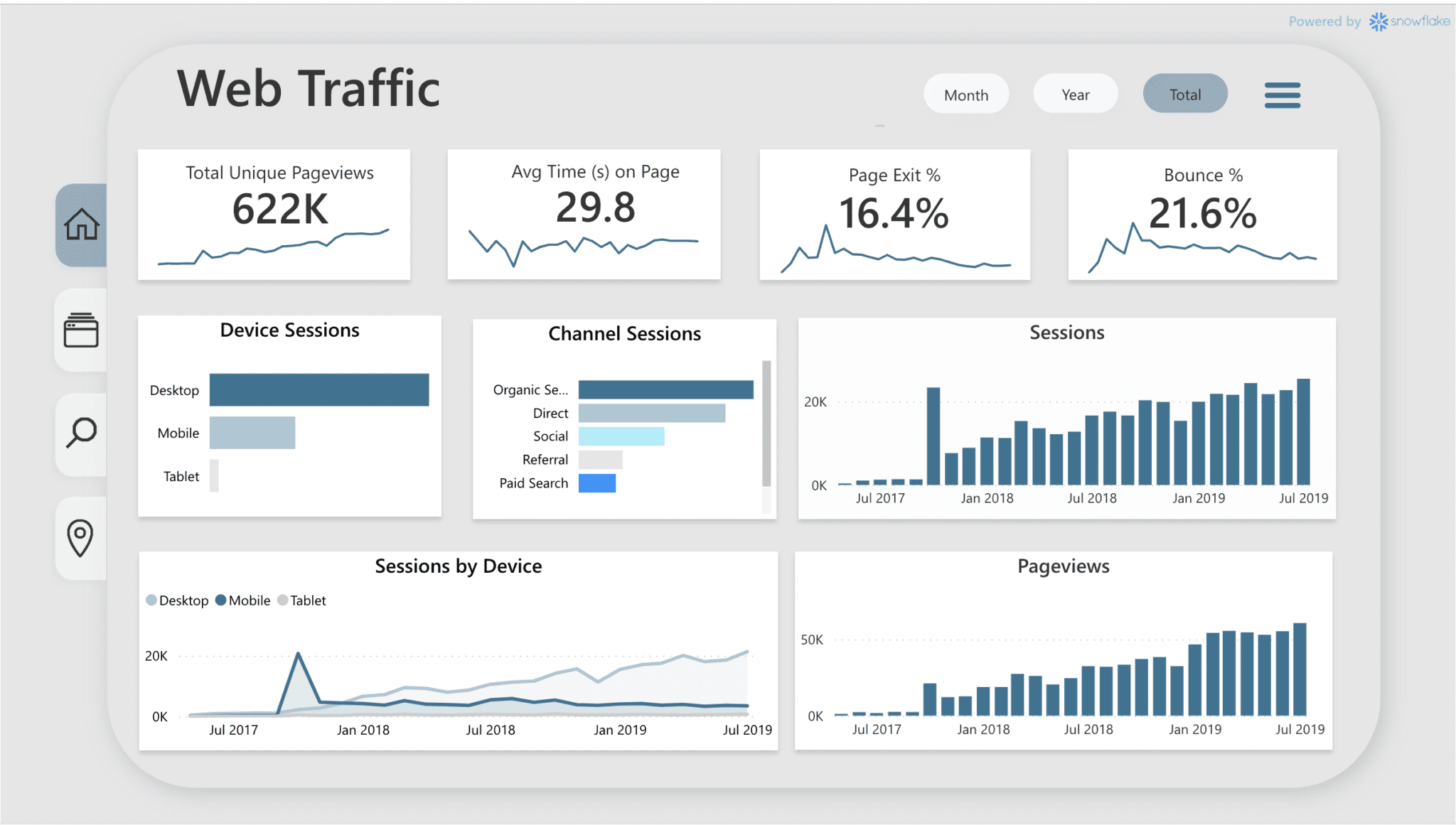
We build custom dashboards that transform complex datasets into intuitive, real-time visual insights across industries such as healthcare, retail, supply chain, marketing, manufacturing, logistics, and customer service. Our solutions focus on optimizing operational efficiency, tracking KPIs, enhancing user experience, and supporting data-driven decision-making. Every dashboard is fully interactive, mobile-responsive, and aligned with your specific business goals to deliver maximum impact.
A dashboard development service involves the creation and design of interactive, data-driven dashboards and reports using tools like Power BI. These dashboards help businesses visualize and analyze data efficiently, making it easier to track performance, make decisions, and identify trends.
They design custom dashboards, integrate data, and train your team. Our consultants ensure the solution fits your business needs.
Yes, we connect Power BI to your current data sources for seamless reporting. This includes databases, Excel files, and cloud services.
Improved Decision Making: Dashboards provide real-time, visual insights that support data-driven decision-making.
Data Accessibility: Dashboards consolidate data from multiple sources into one view, making it easier to access and analyze.
Time Efficiency: Automated data updates and visualizations save time compared to manual reporting processes.
Actionable Insights: Dashboards highlight key performance indicators (KPIs) and trends, helping users make informed decisions quickly.
Team Academy is headquartered in Doha, Qatar, serving as a leading provider of professional training and development solutions. Our services extend across the Middle East, North Africa (MENA), and South Asia regions, delivering high-impact learning experiences tailored to the needs of modern businesses.
Where as we provide services in person in Qatar premises , for other regions we do the service online .
The time required depends on the complexity of the dashboard and the amount of data involved. A simple dashboard might take anywhere from a few days to a week, while more complex dashboards with multiple data sources and advanced analytics may take several weeks to develop.
We offer ongoing support to ensure your dashboards continue to function smoothly. This includes:
Bug fixes and troubleshooting
Data refresh and maintenance
Updates to dashboards as your business needs evolve
User support and troubleshooting
Support plans are typically available as part of our service offerings.