📊 SQL Server to Power BI: Building Scalable, Insight-Driven Dashboards 🔄📈
In this session, participants gained hands-on exposure to building scalable, high-performance Power BI dashboards by integrating SQL Server, mastering slicers, and selecting the right chart types for meaningful insights. The focus was on handling large datasets efficiently and transforming raw data into visually compelling stories.
🗄️ SQL Server & Power BI: Working Smarter with Big Data
A key takeaway from the session was understanding where Power BI fits in the data ecosystem. Power BI is a powerful visualization and analytics tool, not a data warehouse
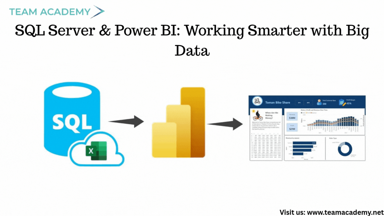
To handle large datasets (10GB+), participants were guided to:
Install SQL Server (free editions available) for backend processing
Clean, transform, and aggregate data in SQL Server first
Import the refined dataset into Power BI for faster performance
The differences between Import Mode and Direct Query were also discussed:
Import Mode 🚀: Faster visuals, supports multiple data sources
Direct Query 🔄: Real-time data, but limited modeling flexibility
This approach ensures scalability, accuracy, and optimal dashboard performance.
📂 Working with the Northwind Traders Dataset
The team addressed challenges related to accessing and sharing the Northwind Traders PBIX file. Once resolved, participants were instructed to:
Save and open the classwork PBIX file
Explore existing slicers for category and geography
Create additional tables to support image-based icons
This dataset served as the foundation for both academic practice and real-world dashboard design.
🎛️ Power BI Slicers: Design Meets Usability
A major portion of the session focused on slicers, a critical element for interactive dashboards. Participants explored:
Text slicers and button slicers
Formatting options like borders, shadows, and search
Vertical button layouts for better screen utilization
Well-designed slicers not only improve usability but also enhance the overall visual appeal of reports.
📈 Choosing the Right Charts for the Right Story
The session provided a deep dive into Power BI chart types and when to use them effectively:
🔹 Bar & Column Charts
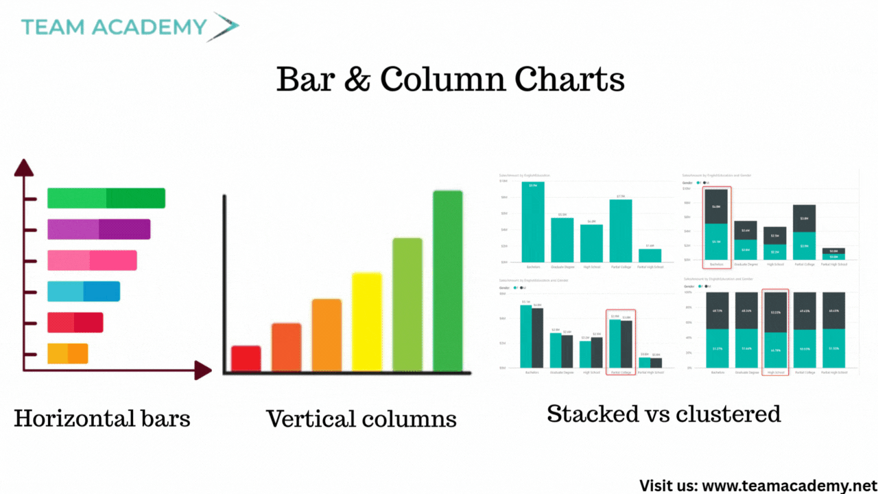
Horizontal bars → Best for ranking
Vertical columns → Best for comparison
Stacked vs clustered → Depends on analysis intent
100% stacked charts → Useful for capacity vs target (not ideal for sales)
🔹 Line & Area Charts
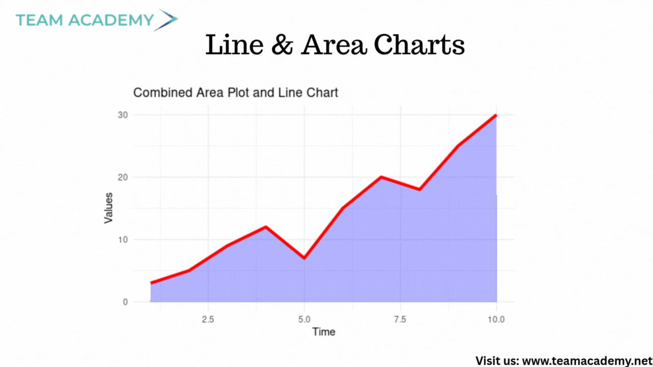
Ideal for trend analysis over time
Secondary Y-axis for comparing metrics on different scales
Area charts add visual emphasis through shading
🔹 Advanced Visuals
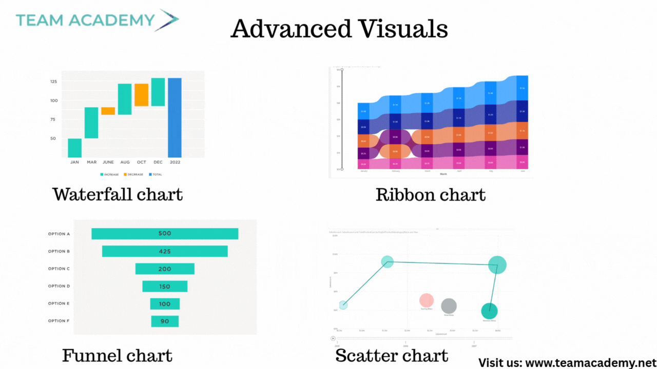
Waterfall charts for variance analysis
Ribbon charts for ranking changes
Funnel charts for conversion analysis
Scatter charts with quadrants for performance and anomaly detection
Participants also learned why Power BI’s default forecasting should be used cautiously and why machine learning models offer more reliable predictions.
🎨 Dashboard Design Best Practices
Beyond charts, the session emphasized:
Using data labels for clarity
Filtering out blanks for clean visuals
Applying consistent formatting (fonts, colors, spacing)
Understanding data context before selecting visuals
The goal was to move from basic reports to executive-ready dashboards.
🧠 Key Takeaways
✔️ Process large data in SQL Server, not Power BI
✔️ Choose slicers and visuals based on user experience
✔️ Match chart types to business questions
✔️ Design dashboards that are clean, interactive, and insightful
🚀 What’s Next?
Participants were encouraged to:
Build custom dashboards using learned techniques
Apply concepts to real organizational datasets
Prepare polished presentations for the next session
This session laid a strong foundation for data-driven storytelling with Power BI, blending backend efficiency with front-end excellence.