Join Our Community
📊 Power BI Data Preparation & Transformation Essentials
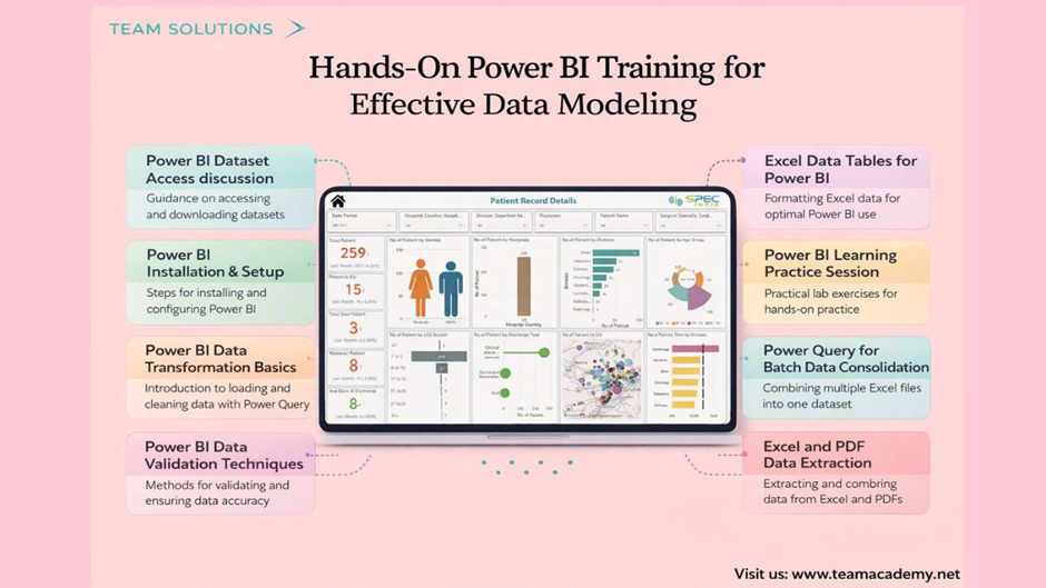
This session delivered a hands-on introduction to working with Power BI datasets, focusing on data access, validation, and transformation using Power Query. Participants learned how to prepare clean, reliable data—the foundation of accurate reporting and impactful dashboards.
🔗 Accessing Power BI Datasets
The session began with clear, step-by-step guidance on accessing the course dataset provided by Team Academy.
Participants learned how to:
🌐 Download datasets via the shared URL
📁 Locate files in the Downloads folder
🗜️ Extract and rename the folder as “Power BI Dataset”
🖥️ Prepare files for use in Power BI Desktop
The entire process took just 1–2 minutes, ensuring everyone could follow along smoothly.
⚙️ Power BI Installation & Setup
Before diving into data transformation, the team ensured all learners were set up correctly.
Key setup actions included:
Opening Power BI Desktop
Checking the installed version
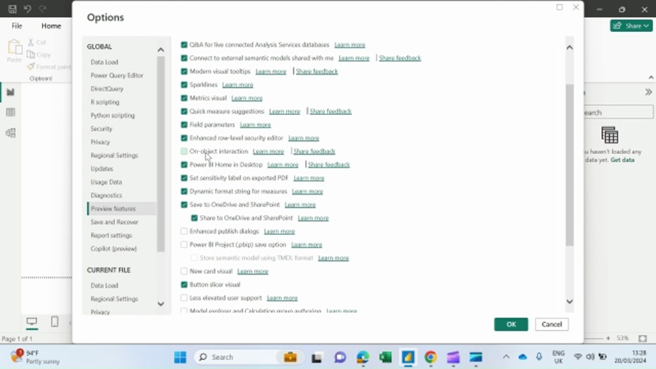
🔍 Enabling Preview Features via the Help menu
🔄 Restarting Power BI to activate new capabilities
💡 Learners were advised to use Windows laptops for upcoming lab sessions to ensure full functionality.
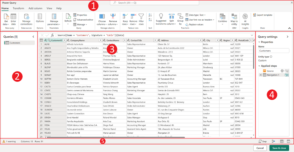
🧹 Power Query: The Data Preparation Engine
Power Query was introduced as the heart of data transformation—often described as a “data kitchen” where raw data is cleaned and prepared before analysis.
Participants explored:
Loading data from Excel workbooks
Selecting specific tables instead of entire sheets
Avoiding unnecessary or unclean data at source
Understanding why clean inputs lead to better outputs
👨🍳 Clean data in → trusted insights out.
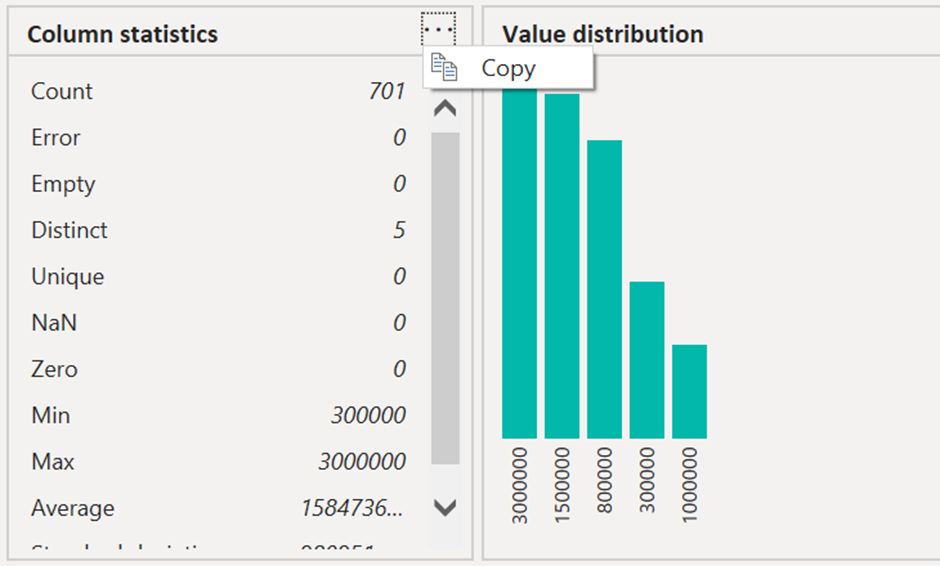
✅ Data Validation Before Cleaning
Rather than jumping straight into cleansing, the session emphasized validating data first.
Validation techniques covered:
📊 Column statistics
📈 Value distribution
➗ Totals, averages, and standard deviation checks
🧠 Validating metadata instead of entire large datasets
This approach saves time and significantly reduces reporting errors later.
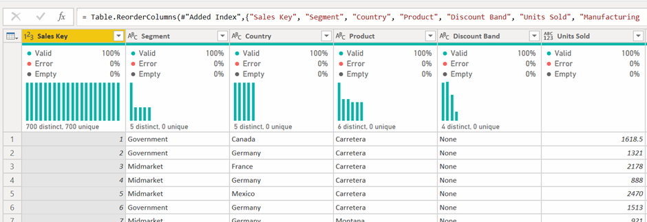
📑 Excel Tables vs Sheets: A Critical Difference
Learners explored why formatting data as Excel tables is essential for efficient Power BI workflows.
Key takeaways:
Tables load cleaner than full worksheets
Structured data reduces transformation effort
Proper formatting improves long-term maintainability
❓ Questions were encouraged to ensure clarity before moving ahead.
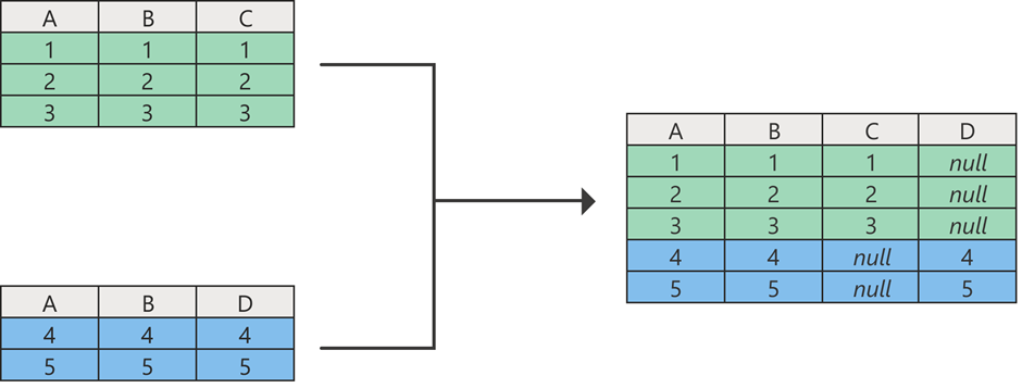
🔄 Combining Multiple Files with Power Query
Hands-on exercises focused on consolidating data efficiently.
Participants practiced:
Merging Sales 2022 and Sales 2023 datasets
Appending files with identical column structures
📂 Using folder-based loading to automate recurring data updates
🚀 This method is ideal for organizations handling frequent or large-scale data imports.
📂 Extracting Data from Excel & PDF Files
The session also introduced advanced extraction scenarios.
Learners learned how to:
Load data from multiple Excel files
Extract structured tables from PDF documents
Combine different file types into a single dataset
📌 Practice exercises were assigned to reinforce learning before the next class.
🧪 Practice, Repeat, Master
To strengthen learning outcomes, participants were encouraged to:
🔁 Repeat lab exercises
🎥 Review session recordings
📊 Practice with their own datasets
📅 Upcoming sessions will be held online, supporting flexibility during the instructor’s travel.
🎯 Key Takeaways
✔ Clean data is the foundation of effective BI
✔ Power Query is essential for scalable data preparation
✔ Validation before cleaning saves time and errors
✔ Hands-on practice accelerates mastery
📌 Practice consistently, think like a data professional, and insights will follow.
🏥 Designing Powerful Data Models in Power BI for Healthcare Analytics
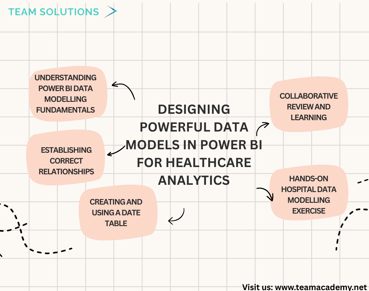
Data modelling is the backbone of meaningful analytics, and this session focused on helping participants design strong, logical data models in Power BI using a real-world hospital patient records case study 📊.
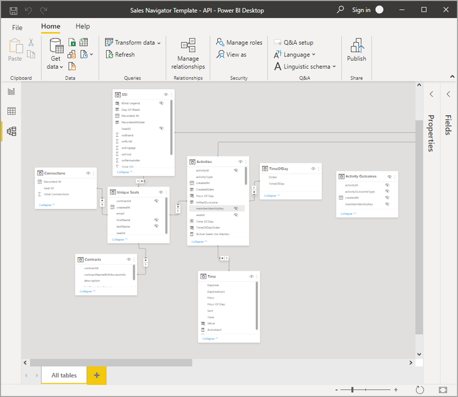
🧠 Understanding Power BI Data Modelling Fundamentals
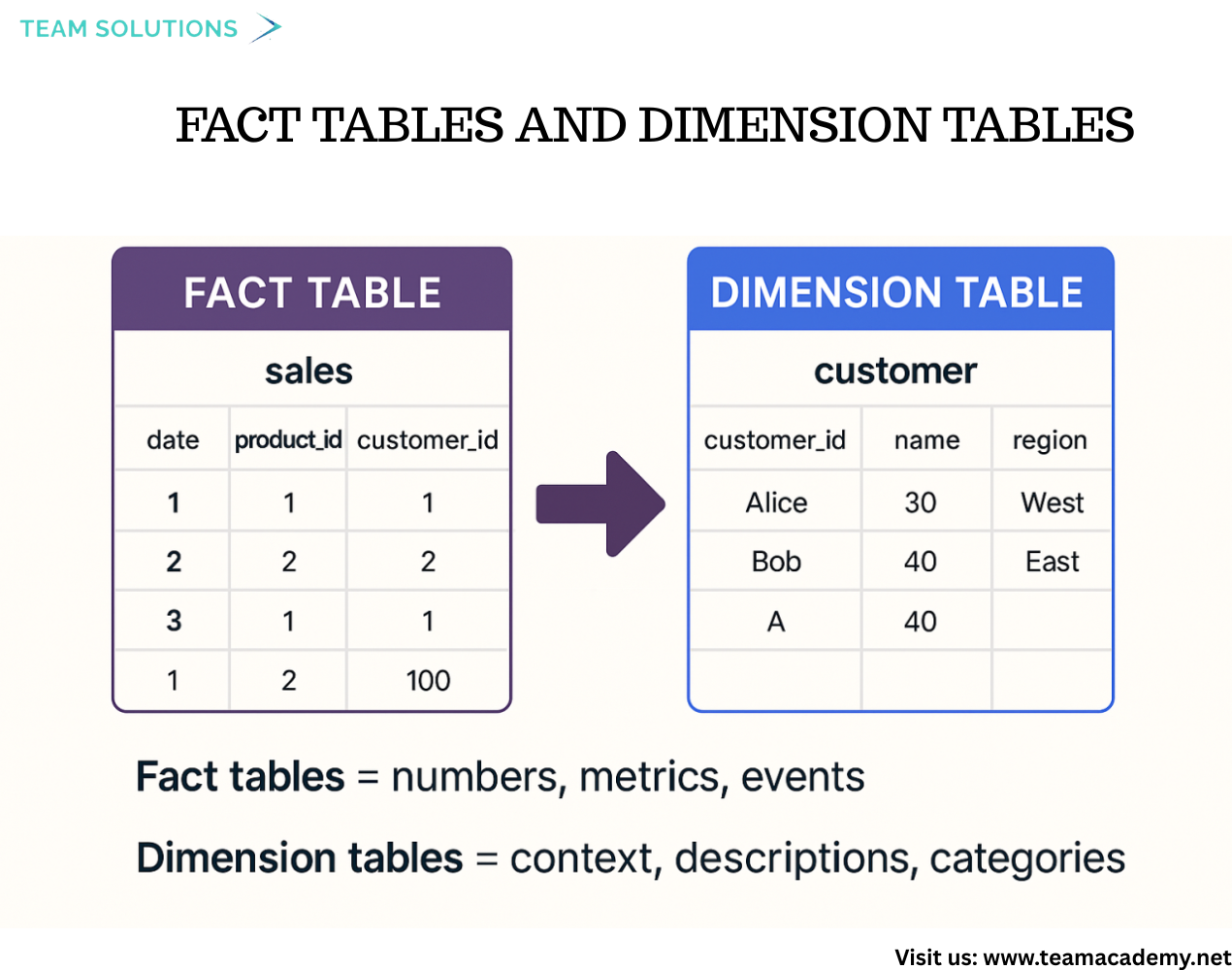
The session began with an introduction to fact tables and dimension tables, explaining how transactional data (facts) and descriptive data (dimensions) work together to support analysis. Participants learned why unique identifiers (primary keys) are critical in dimension tables and how they connect to foreign keys in fact tables to create reliable relationships 🔗.
A key takeaway was that Power BI models should be driven by data structure, not just reporting requirements—ensuring scalability and accuracy as business questions evolve.
🔁 Establishing Correct Relationships
Participants practiced creating relationships between tables, with strong emphasis on:
Many-to-one relationships (many records in the fact table, one record in the dimension table)
Avoiding ambiguous or incorrect relationship types
Understanding that column names don’t need to match, as long as the values align correctly
This helped reinforce logical thinking and reduced common modelling mistakes that can lead to incorrect results.
📅 Creating and Using a Date Table
To enable time-based analysis, the session included a walkthrough on creating a date table using DAX 🗓️.
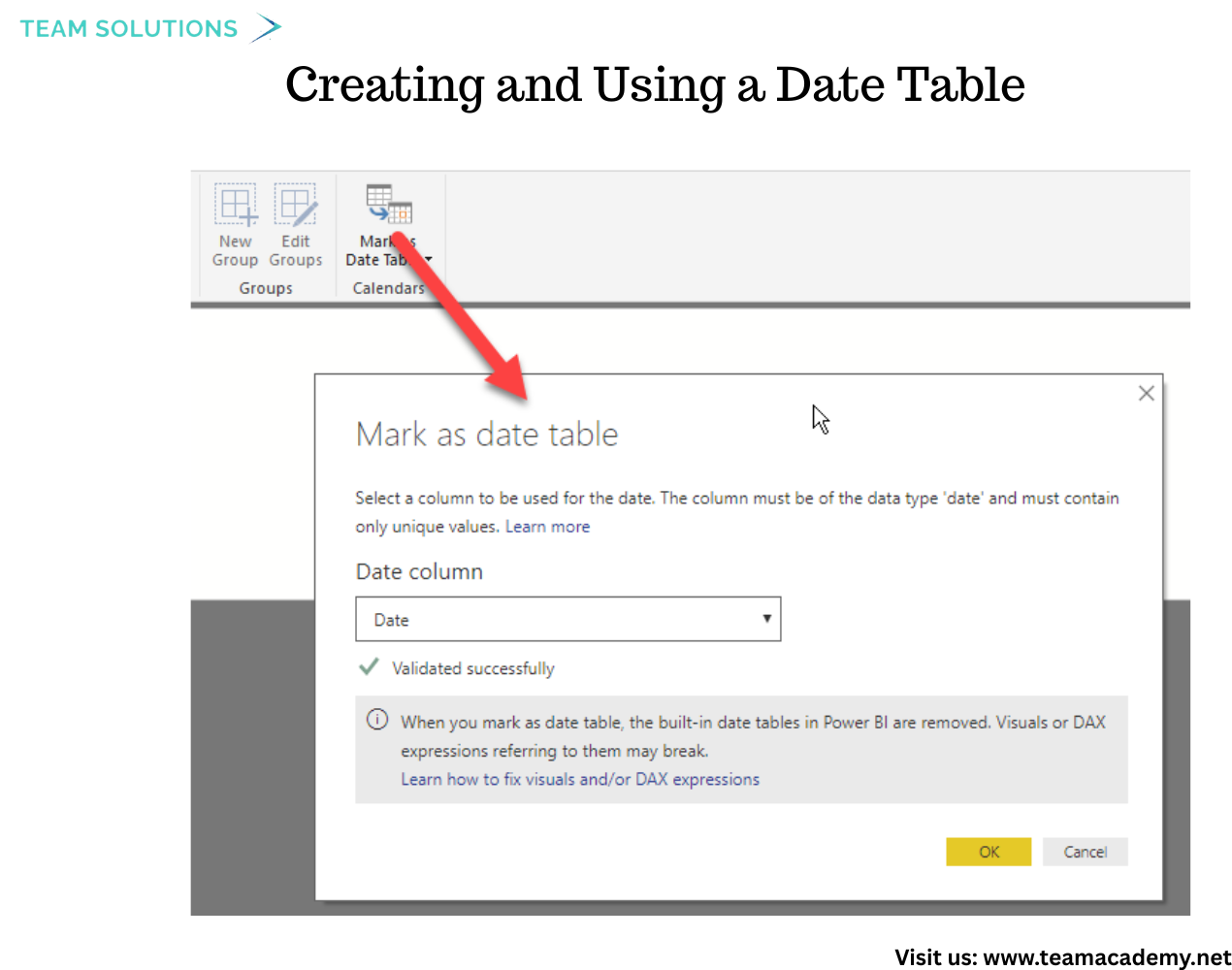
Participants learned how to:
Build a reusable date dimension
Link multiple date fields (such as order, required, and shipped dates) to a single date table
Prepare the model for time intelligence calculations
This step is essential for trends, comparisons, and performance analysis over time.
🏥 Hands-On Hospital Data Modelling Exercise

Using a detailed hospital dataset, participants worked through a practical lab exercise that involved:
Importing five Excel sheets
Cleansing and validating data
Using a data dictionary to identify correct keys
Connecting patient, encounter, and procedure tables logically
The exercise encouraged participants to think like data modellers, not just Power BI users, strengthening their analytical mindset 💡.
🤝 Collaborative Review and Learning
After completing the exercise, participants shared their progress and challenges. Common issues—such as difficulty identifying relationships or connecting patient data—were reviewed and clarified. This collaborative feedback helped reinforce best practices and build confidence in applying data modelling concepts independently.
🚀 Key Takeaways
By the end of the session, participants were able to:
Design clean fact and dimension tables
Identify and apply primary and foreign keys correctly
Build many-to-one relationships confidently
Create and integrate a date table for time analysis
These skills form a strong foundation for advanced DAX, visualization, and certification preparation, and are essential for building professional Power BI solutions.
✨ Final Thought:
Strong dashboards start with strong data models. Mastering relationships, keys, and structure allows Power BI users to unlock accurate insights—especially in complex domains like healthcare.
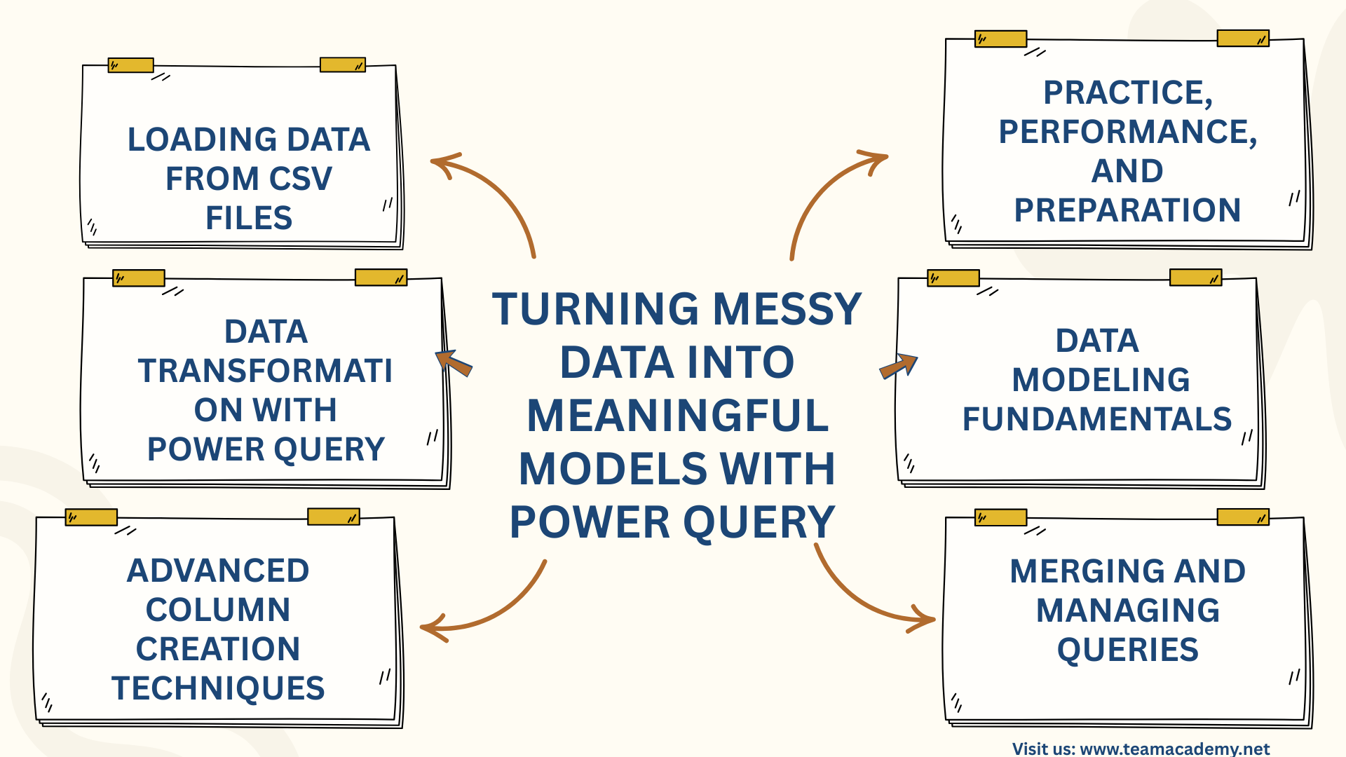
📊 Turning Messy Data into Meaningful Models with Power Query 📊
🚀 Introduction
This session focused on building strong foundations in Power Query and Power BI, guiding participants through real-world data analysis techniques using the Northwind Traders e-commerce case study. The goal was to move beyond Excel-based lookups and manual calculations and instead adopt scalable, performance-driven data modeling and transformation practices.
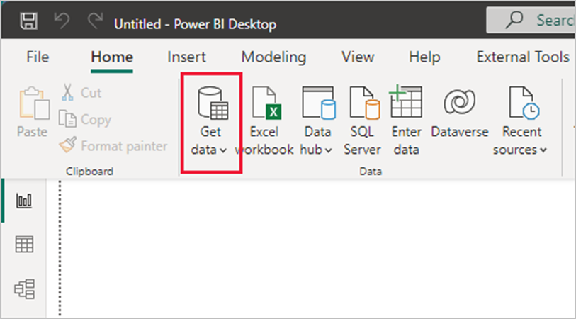
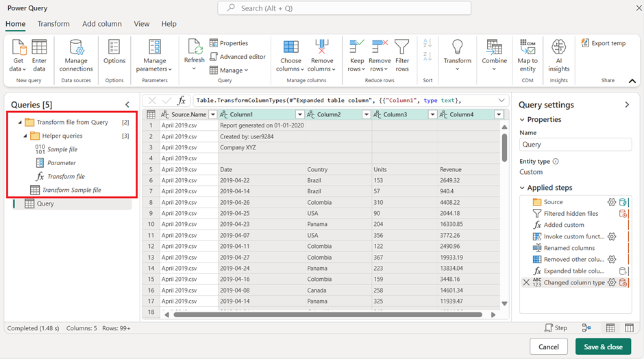
📂 Loading Data from CSV Files
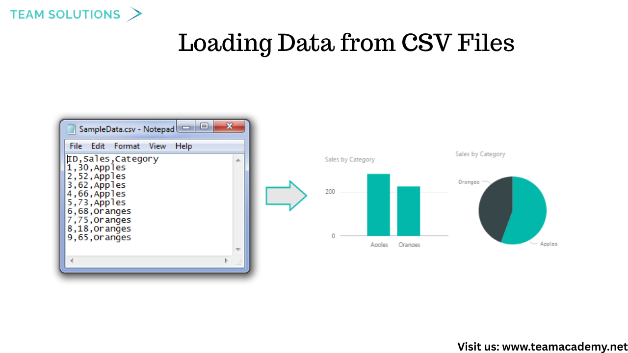
Participants learned how to load data from multiple CSV files, a common format used by IT teams for sharing large datasets. Using a folder-based approach, several files—such as orders, products, customers, employees, and shippers—were imported into Power BI in one go.
💡 Key takeaway: Regardless of whether the data source is Excel, CSV, SQL Server, or SharePoint, Power Query transformation logic remains the same.
🔧 Data Transformation with Power Query
The session covered essential Power Query techniques used in everyday business reporting:
✂️ Splitting text columns using delimiters
🧮 Creating calculated columns (e.g., total sales, discounts)
📅 Handling date, time, and duration fields
🚫 Managing null values and replacing errors
🔁 Promoting headers and correcting data types
Participants also learned how to undo transformations by removing applied steps—encouraging experimentation without fear of breaking data.
🧠 Advanced Column Creation Techniques
Several powerful features were introduced to simplify data preparation:
🧪 Columns from Example to auto-generate transformations
🧩 Conditional columns for business logic (e.g., shipping delay categories)
🔢 Mathematical operations for sales and performance metrics
These tools showed how Power Query can handle most Excel use cases—without complex formulas.
🧩 Merging and Managing Queries
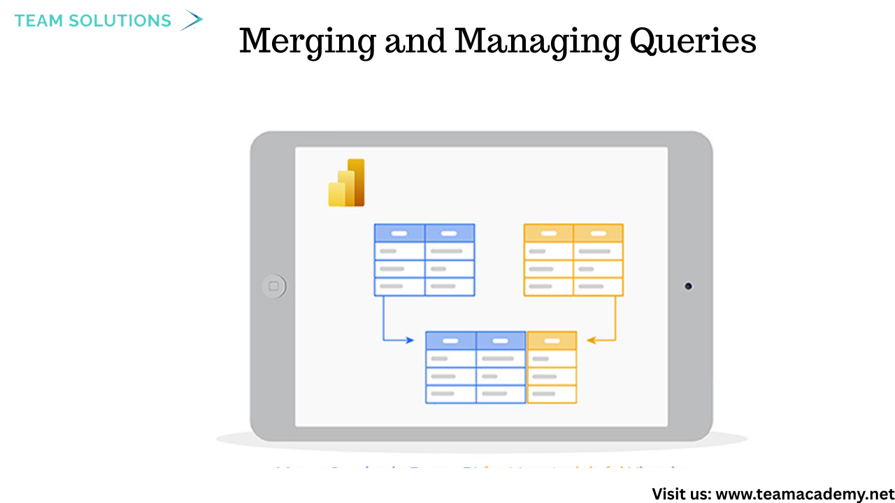
Instead of relying on Excel VLOOKUPs, participants learned how to merge queries in Power Query to combine related tables such as products and categories. This approach improves performance and creates cleaner data models.
The difference between duplicating queries and referencing queries was also explained, helping participants manage transformations efficiently.
🏗️ Data Modeling Fundamentals
The session introduced core data modeling concepts critical for reporting and certification exams:
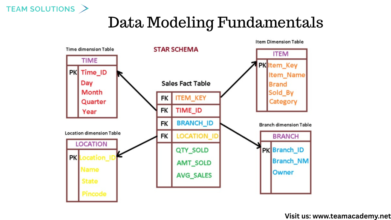
📌 Fact tables vs Dimension tables
⭐ Star schema vs ❄️ Snowflake schema
🔗 Understanding table relationships for flexible analysis
These concepts were explained using real e-commerce examples, reinforcing how proper modeling supports faster, more accurate insights.
📈 Working with Dates, Durations, and Measures
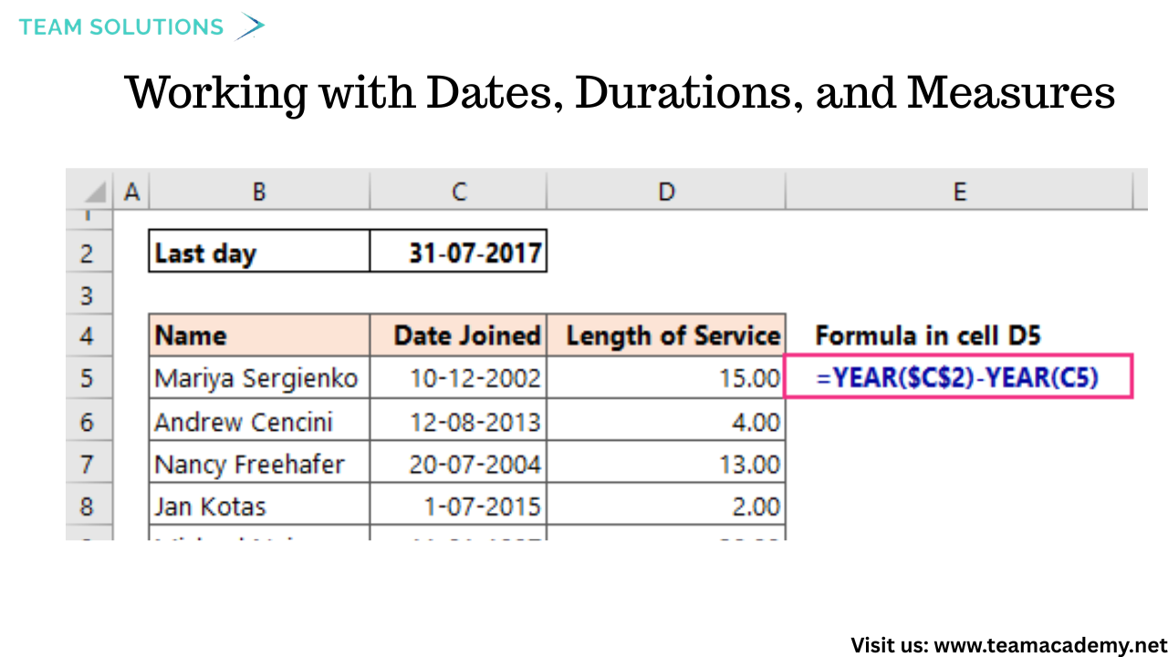
Participants practiced transforming date-related fields, including:
Calculating age from date of birth
Measuring durations between timestamps
Extracting year and month values
They also learned best practices such as minimizing applied steps to improve report performance and user experience.
🎯 Practice, Performance, and Preparation
The session emphasized the importance of hands-on practice. Participants were encouraged to:
Experiment with transformations independently
Bring real business datasets to future sessions
Prepare for upcoming topics such as appending queries, advanced modeling, and exam-focused scenarios
This case study approach closely mirrors real-world business intelligence challenges and aligns well with PL-300 certification preparation.
🔑 Key Takeaways
✅ Power Query simplifies complex data preparation
✅ CSV files are common and powerful data sources
✅ Proper modeling improves performance and scalability
✅ Star schemas are preferred for reporting
✅ Practice is essential for mastery
📌 What’s Next?
The upcoming sessions will dive deeper into appending queries, advanced data modeling, and real-life dashboard scenarios—helping participants turn clean data into meaningful insights
Need assistance with power query file source change
My question is if I have 5 to 6 files and I need to change their sources in one go instead of changing each file's source separately and all the files are in the same source of folder. How to do it?
🛡️ Patient Safety in Healthcare: Preventing Errors, Managing Risks, and Saving Lives
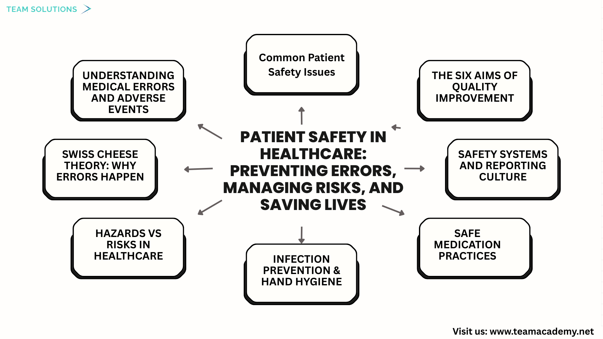
🌍 Introduction
Patient safety is a critical pillar of healthcare quality. This session provided an in-depth exploration of patient safety concepts, focusing on how medical errors occur, how risks can be reduced, and how healthcare systems can be designed to protect patients from harm. Through real-world examples and proven frameworks, participants were encouraged to think beyond individual mistakes and focus on system-wide safety improvements.
⚠️ Understanding Medical Errors and Adverse Events
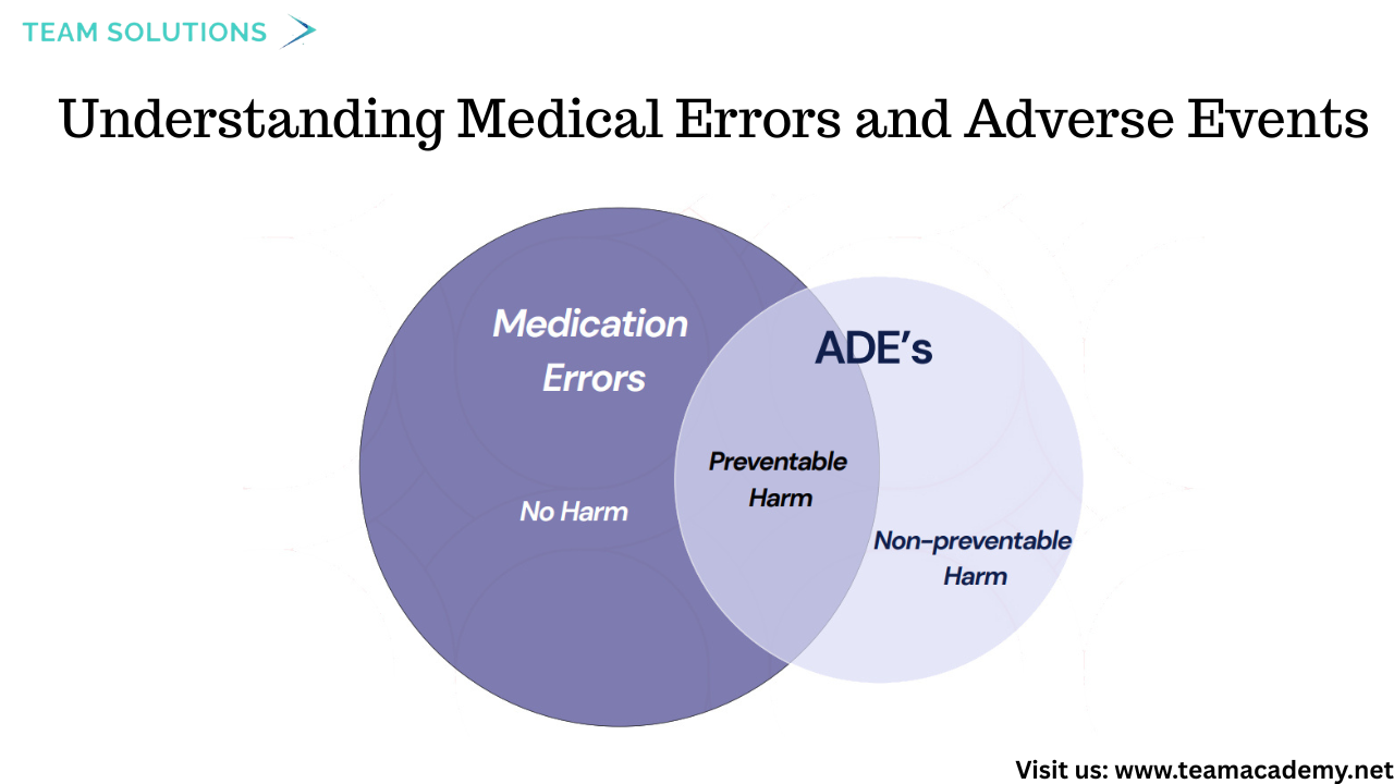
The discussion began with defining medical errors as failures of planned actions or the use of incorrect plans. These were categorized into:
❌ Preventable adverse events
⚠️ Non-preventable adverse events
🚨 Adverse events due to negligence
Special attention was given to near-miss events and close calls, where harm was avoided but could have occurred. These events were highlighted as valuable learning opportunities rather than incidents to hide.
🧀 Swiss Cheese Theory: Why Errors Happen
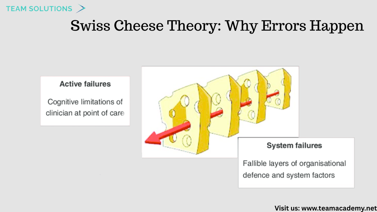
One of the key models discussed was the Swiss Cheese Theory, which explains how patient harm occurs when multiple safety barriers fail at the same time.
🔪 Active failures (Sharp End): Errors made by frontline staff
🧱 Latent failures (Blunt End): Systemic weaknesses such as poor policies, inadequate training, or flawed processes
The session emphasized that improving patient safety requires addressing both human errors and system design flaws.
🚧 Hazards vs Risks in Healthcare
Participants explored the difference between hazards and risks using simple but powerful examples:
🦈 A hazard exists (e.g., infection risk), but risk depends on exposure and controls
💧 Wet floors, medication mix-ups, and poor hand hygiene were discussed as everyday healthcare risks
Understanding this distinction helps healthcare professionals proactively reduce harm.
🏥 Common Patient Safety Issues
Several high-risk areas in healthcare were reviewed, including:
💊 Medication errors
🆔 Wrong patient identification
🤕 Patient falls
🛏️ Hospital-acquired pressure injuries
🦠 Healthcare-associated infections (HAIs)
Each was discussed in the context of prevention, reporting, and system improvement.
🧼 Infection Prevention & Hand Hygiene
A major focus was placed on infection prevention, including:
Central line-associated bloodstream infections
Ventilator-associated events
Surgical site infections
Catheter-associated urinary tract infections
The WHO’s 5 Moments of Hand Hygiene 🖐️ were reinforced as one of the simplest yet most effective ways to prevent infections and save lives.
💊 Safe Medication Practices
The session highlighted the Seven Rights of Medication Administration:
✔ Right patient
✔ Right medication
✔ Right dose
✔ Right route
✔ Right time
✔ Right documentation
✔ Right reason
These principles were presented as essential safeguards against medication-related harm.
🧠 Safety Systems and Reporting Culture
Healthcare safety was framed as a shared responsibility, supported by:
📋 Policies and procedures
💻 Electronic health records
📦 Barcode medication administration
👥 Competency assessments
The importance of incident reporting was emphasized, encouraging transparency and learning rather than blame—even when reputational or financial risks exist.
🎯 The Six Aims of Quality Improvement
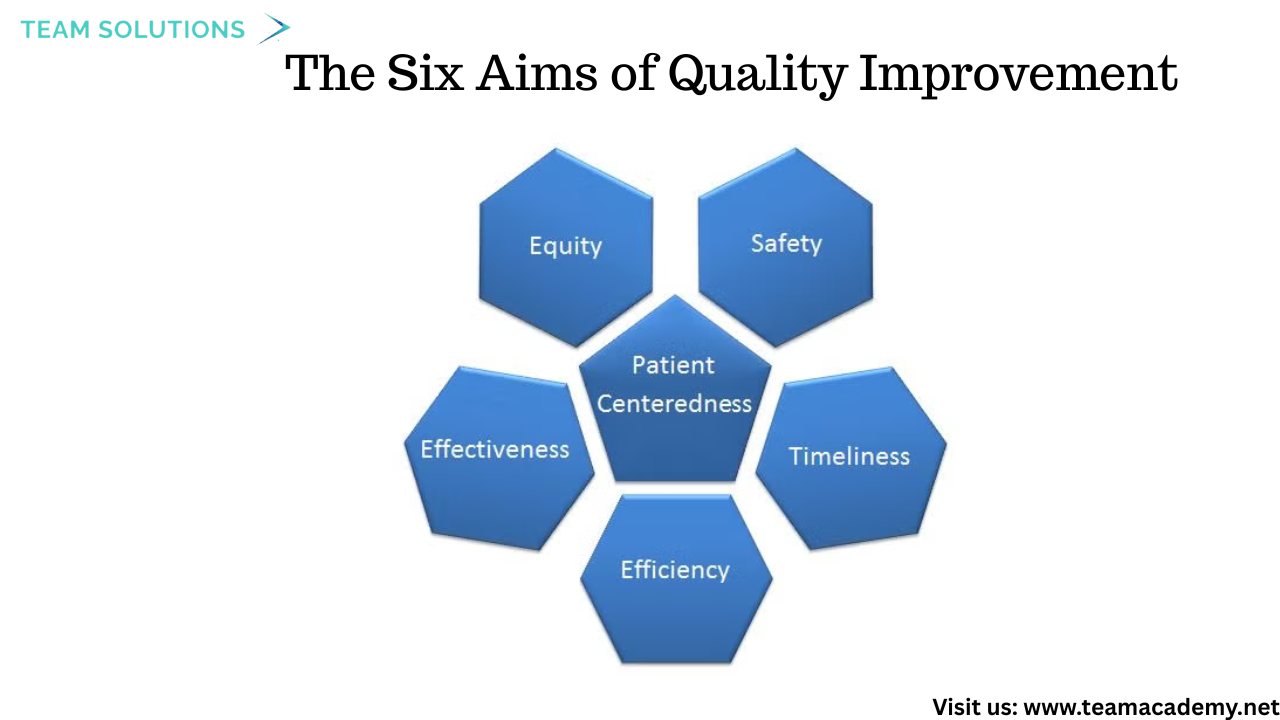
Patient safety was aligned with the broader six aims of healthcare quality:
Safety
Effectiveness
Patient-centered care
Timeliness
Efficiency
Equity
The distinction between equality and equity was discussed, reinforcing the need to tailor care to individual patient needs.
🔍 Key Takeaways
✅ Most patient harm is preventable
✅ Systems, not individuals, are often the root cause
✅ Near misses are learning opportunities
✅ Strong safety culture saves lives
✅ Continuous improvement is essential
🚀 Moving Forward
Participants were encouraged to reflect on current practices in their workplaces, identify existing safety gaps, and actively contribute to a culture of learning, transparency, and patient-centered care. Continued discussions and assessments on patient safety are planned in upcoming sessions.
👉 Join our Free Demo Class and start your journey toward becoming a certified healthcare quality professional!
👉 Enroll in our Certified Professional in Healthcare Quality (CPHQ) preparation course to level up your career.
👉 Explore Now and start transforming your healthcare practice today
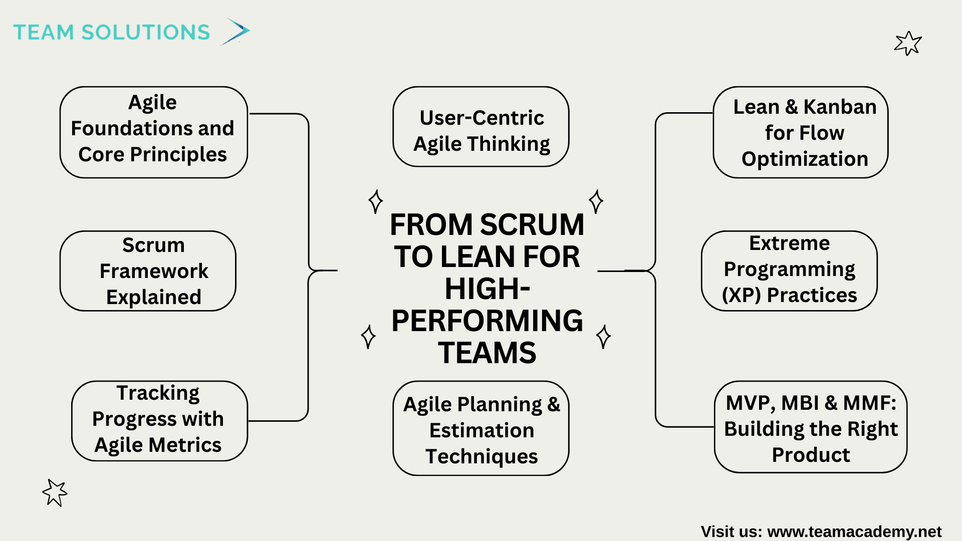
🚀 Agile Methodologies: From Scrum to Lean for High-Performing Teams
🌟 Introduction
Agile project management has become a cornerstone for delivering value in fast-changing environments. This comprehensive training session offered a deep dive into Agile methodologies, covering Scrum, Extreme Programming (XP), Lean, and Kanban, while focusing on practical techniques that enhance collaboration, transparency, and continuous improvement.
🔁 Agile Foundations and Core Principles
The session began with a strong foundation in Agile values and principles, emphasizing:
🤝 Collaboration over rigid processes
🔍 Transparency through visual tracking
🔄 Continuous feedback and improvement
🎯 Delivering real business value early and often
Participants explored how Agile adapts to change while maintaining focus on customer needs and outcomes.
🧭 Scrum Framework Explained
A detailed walkthrough of Scrum fundamentals covered:
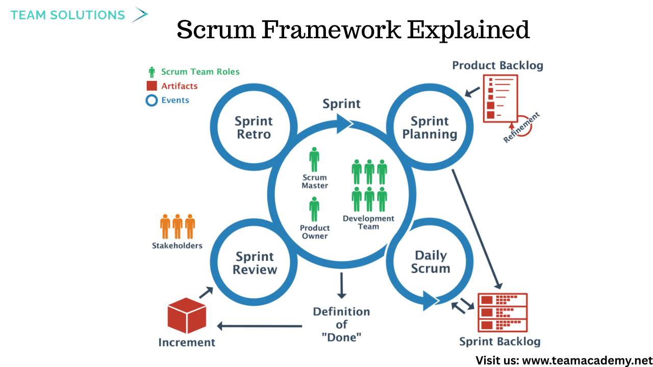
👥 Scrum Roles
Product Owner – Prioritizes the product backlog based on business value
Development Team – Self-organized, cross-functional professionals delivering increments
Scrum Master – Servant leader who removes impediments and supports the team
🗂 Scrum Artifacts
Product Backlog
Sprint Backlog
Product Increment
🔄 Scrum Ceremonies
Sprint Planning
Daily Stand-up (15 minutes ⏱️)
Sprint Review
Sprint Retrospective
Each ceremony was explained with real-world relevance and exam-focused clarity.
📈 Tracking Progress with Agile Metrics
The training emphasized data-driven decision-making using Agile metrics such as:
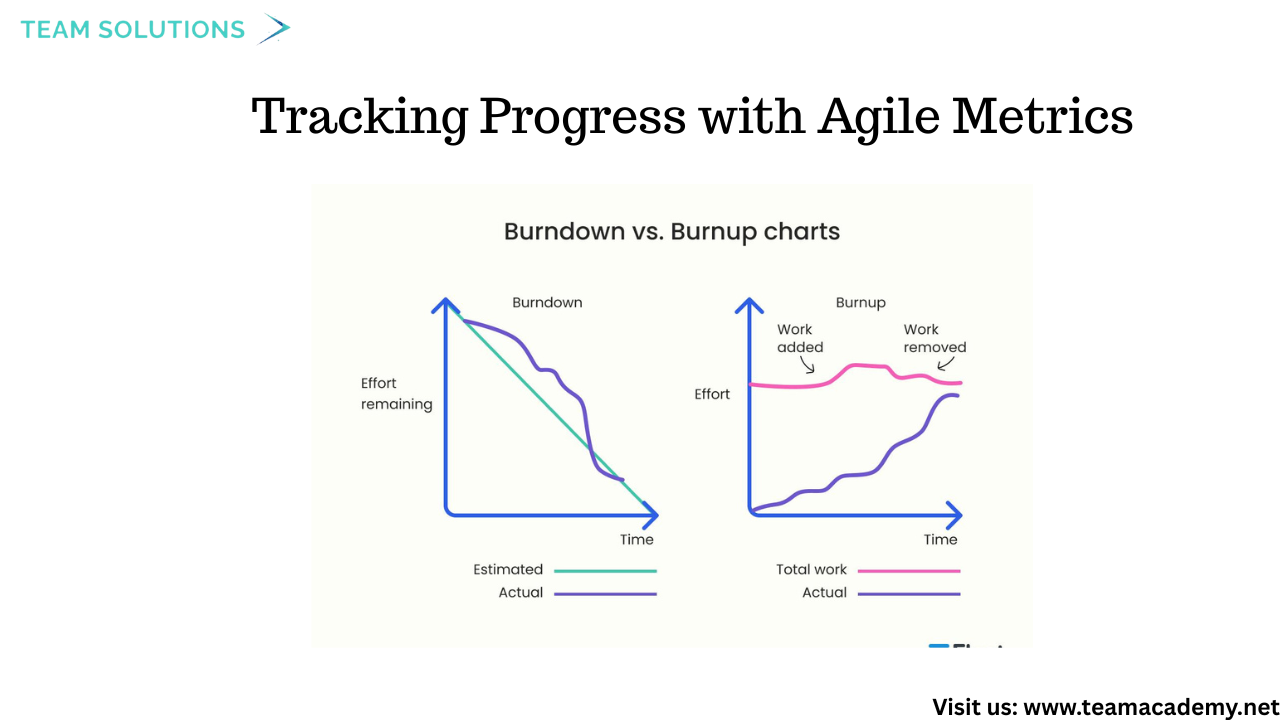
📉 Burn-down Charts – Track remaining work
📈 Burn-up Charts – Show completed work against scope
⚡ Velocity – Measures team capacity per sprint
Participants learned how to interpret these charts to assess whether teams are ahead, behind, or on track.
🧠 Agile Planning & Estimation Techniques
Multiple estimation and prioritization methods were explored, including:
🃏 Planning Poker
📊 Relative sizing with story points
🧮 Wideband Delphi & Affinity Estimation
🔢 100-point method
🎯 MoSCoW prioritization
📦 Kano Model
These techniques help teams align effort with value and manage uncertainty effectively.
🧪 MVP, MBI & MMF: Building the Right Product
A key highlight was understanding how to deliver value early through:
MVP (Minimum Viable Product)
MBI (Minimum Business Increment)
MMF (Minimum Marketable Feature)
These concepts ensure teams validate ideas quickly and avoid overbuilding solutions.
🛠 Extreme Programming (XP) Practices
The session also explored XP principles, including:
👥 Pair programming
🧪 Continuous testing
🔄 TCR (Test–Code–Refactor)
🔗 Continuous integration
🧠 Generalist (T-shaped) team members
XP was positioned as a highly disciplined Agile approach focused on technical excellence.
🧱 Lean & Kanban for Flow Optimization
Lean principles were introduced with a focus on:
🗺 Value Stream Mapping
🚫 Eliminating waste
👀 Visualizing workflow
⛔ Limiting Work in Progress (WIP)
Kanban was highlighted as a practical method for improving flow and predictability without fixed iterations.
🏢 Team Spaces & Communication
The importance of team environments was emphasized, including:
Dedicated team spaces (“caves”) 🕳
Common collaboration areas
Osmotic communication (learning through proximity)
Visual tools like information radiators were shown to improve awareness and transparency.
🎯 User-Centric Agile Thinking
Participants explored techniques to better understand users, such as:
👤 Personas
🧩 User stories
🧪 A/B testing
📊 Net Promoter Score (NPS)
Defect management and “escape defects” were also discussed to reinforce quality-first thinking.
📌 Key Takeaways
✔ Agile is about mindset, not just frameworks
✔ Deliver value early and continuously
✔ Use metrics to guide decisions, not punish teams
✔ Strong collaboration drives successful outcomes
✔ Understanding these concepts is critical for PMP and Agile exams
🚀 What’s Next?
Participants were encouraged to:
Review shared learning materials 📚
Provide feedback 📝
Prepare for upcoming modules focused on deeper Agile application
👉 Join our Free Demo Class
👉 Enroll in our Project Management Programs to master predictive, Agile, and hybrid approaches.
👉 Explore now to deepen your skills and stay ahead in your career
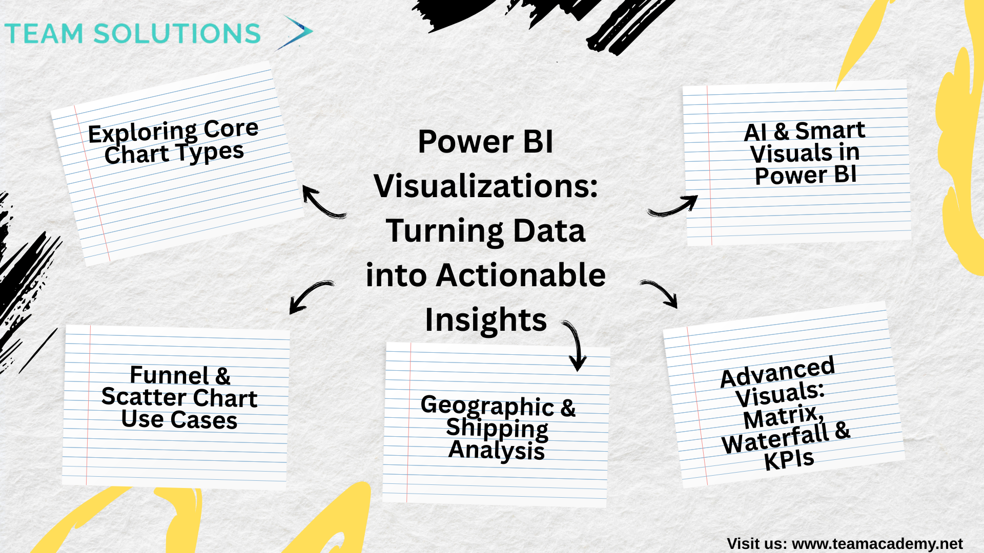
📊 Power BI Visualizations: Turning Data into Actionable Insights
🚀 Introduction
Effective data visualization is the backbone of impactful business intelligence. This session focused on helping learners understand how to transform well-prepared data into meaningful insights using Power BI’s wide range of visualization tools. From basic charts to advanced analytical visuals, the discussion emphasized clarity, accuracy, and business relevance.
📈 Exploring Core Chart Types
Participants explored several commonly used
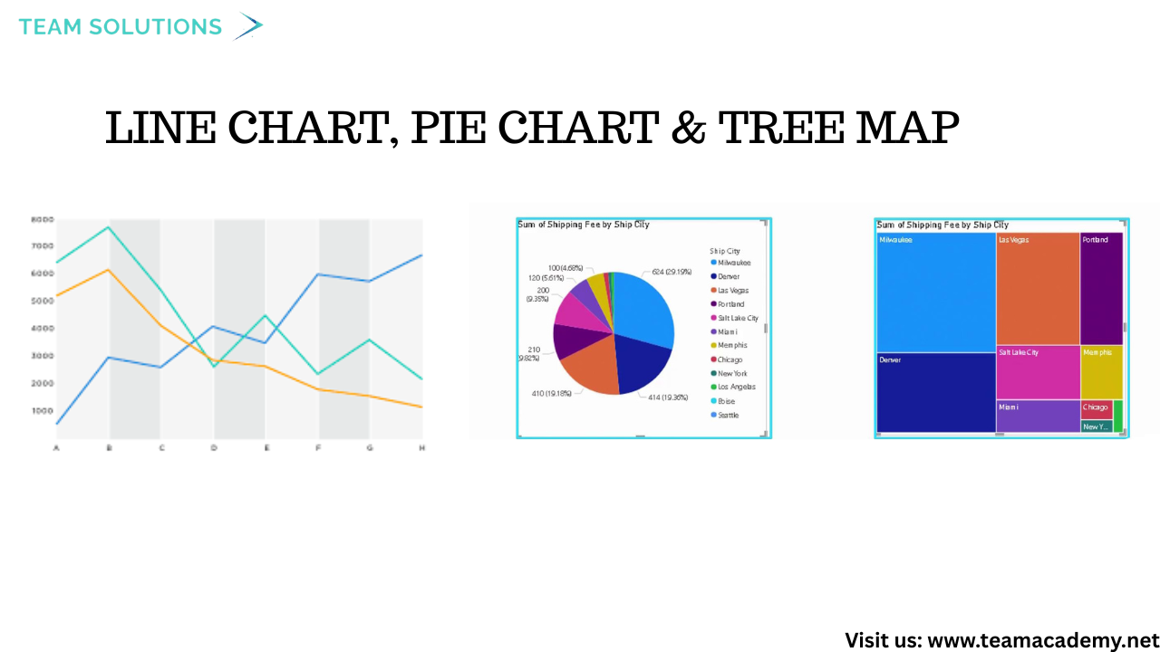
Line Charts for trend analysis over time
Pie & Tree Maps for proportional comparisons
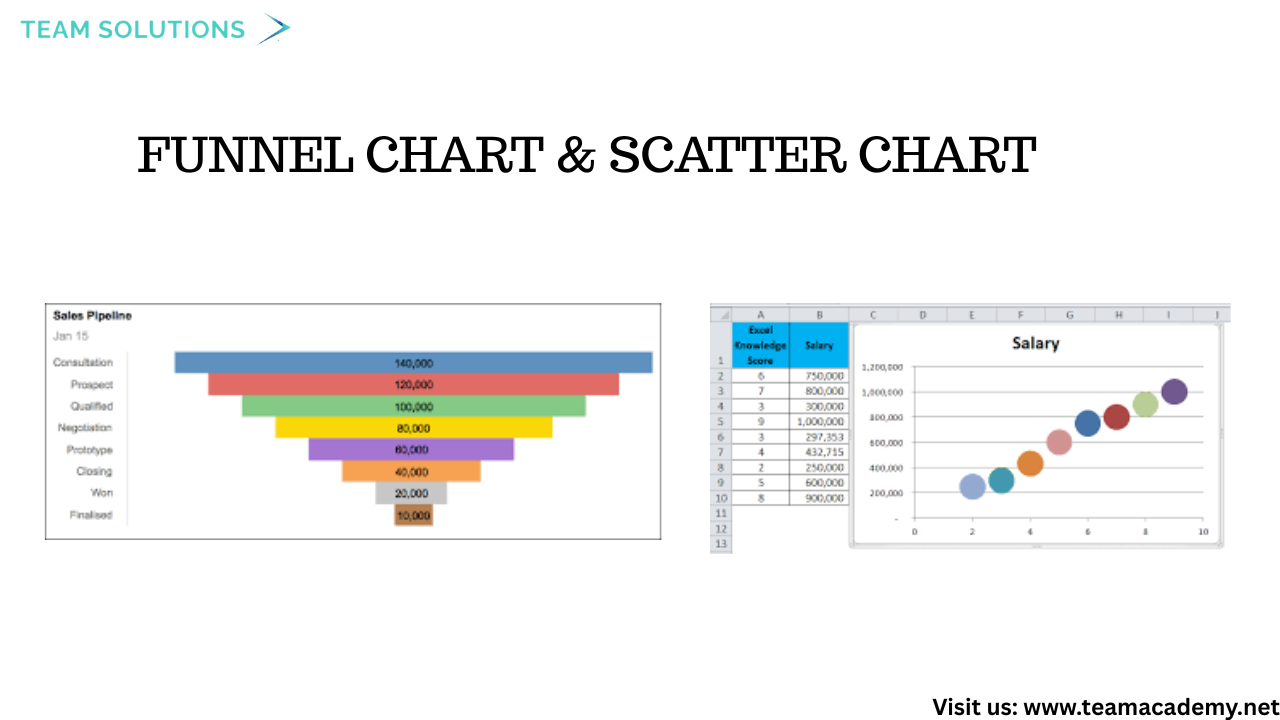
Funnel Charts to analyze sales pipelines and conversion stages
Scatter Charts to compare performance across regions and categories
Special attention was given to data aggregation and formatting, ensuring values were numeric and correctly summarized to avoid misleading visuals.
🧩 Funnel & Scatter Chart Use Cases
Funnel charts were used to analyze sales performance by country, helping identify drop-offs and bottlenecks in the sales process. Scatter charts enabled comparisons between net sales and quantities, making it easier to spot high-performing cities and regions.
Top-N filtering techniques were also demonstrated to focus dashboards on the most impactful data.
🌍 Geographic & Shipping Analysis
Geographical insights were created using maps and scatter visuals, highlighting regional sales performance. The session also covered:
Creating custom columns such as shipping delay and SLA indicators
Handling missing or incorrect data
Visualizing shipping delays using clustered charts and gauge visuals
These techniques help organizations monitor operational efficiency and service performance.
📋 Advanced Visuals: Matrix, Waterfall & KPIs
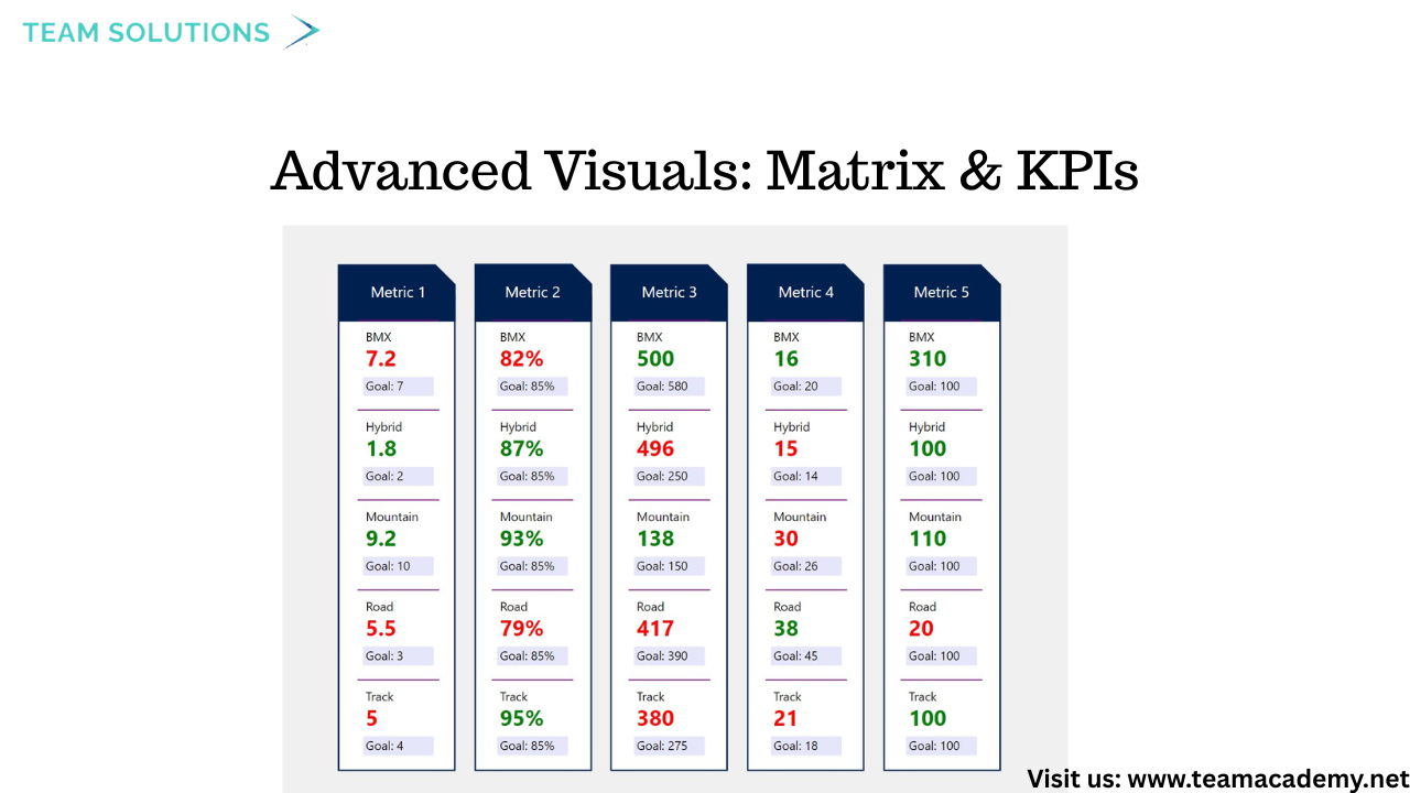
Learners explored advanced visuals to enhance reporting depth:
Matrix visuals for multi-level data breakdowns
Waterfall charts to show positive and negative value changes
Card, KPI, and Gauge visuals to highlight key metrics
Conditional formatting, drill-through functionality, and slicers were introduced to improve interactivity and user experience.
🤖 AI & Smart Visuals in Power BI
The session introduced AI-powered visuals, including:
Q&A Visuals, allowing users to ask questions in natural language
Decomposition Trees, offering hierarchical data analysis
While custom visuals were discussed, the recommendation was to rely on standard Power BI visuals for professional environments due to security and performance considerations.
🔮 What’s Next?
The session concluded with insights into upcoming learning opportunities, including:
Advanced visualization techniques
Microsoft Fabric integration
PowerApps and Power Automate sessions
Certification preparation and mock exam reviews
Participants were encouraged to practice dashboard presentations and apply visualization best practices for real-world scenarios.
🎯 Key Takeaway
Great dashboards aren’t about flashy visuals—they’re about clear storytelling, accurate data, and business-driven insights. Mastering Power BI visualizations empowers professionals to make data-driven decisions with confidence.
📊 Power Query Foundations: Transforming Raw Data into Reliable Insights🚀
The Power Query training program officially kicked off with a technical session designed to build a strong foundation in data extraction, transformation, and preparation using Excel and Power BI. The session combined practical demonstrations with a real-world case study to help participants understand how raw data can be transformed into meaningful insights.
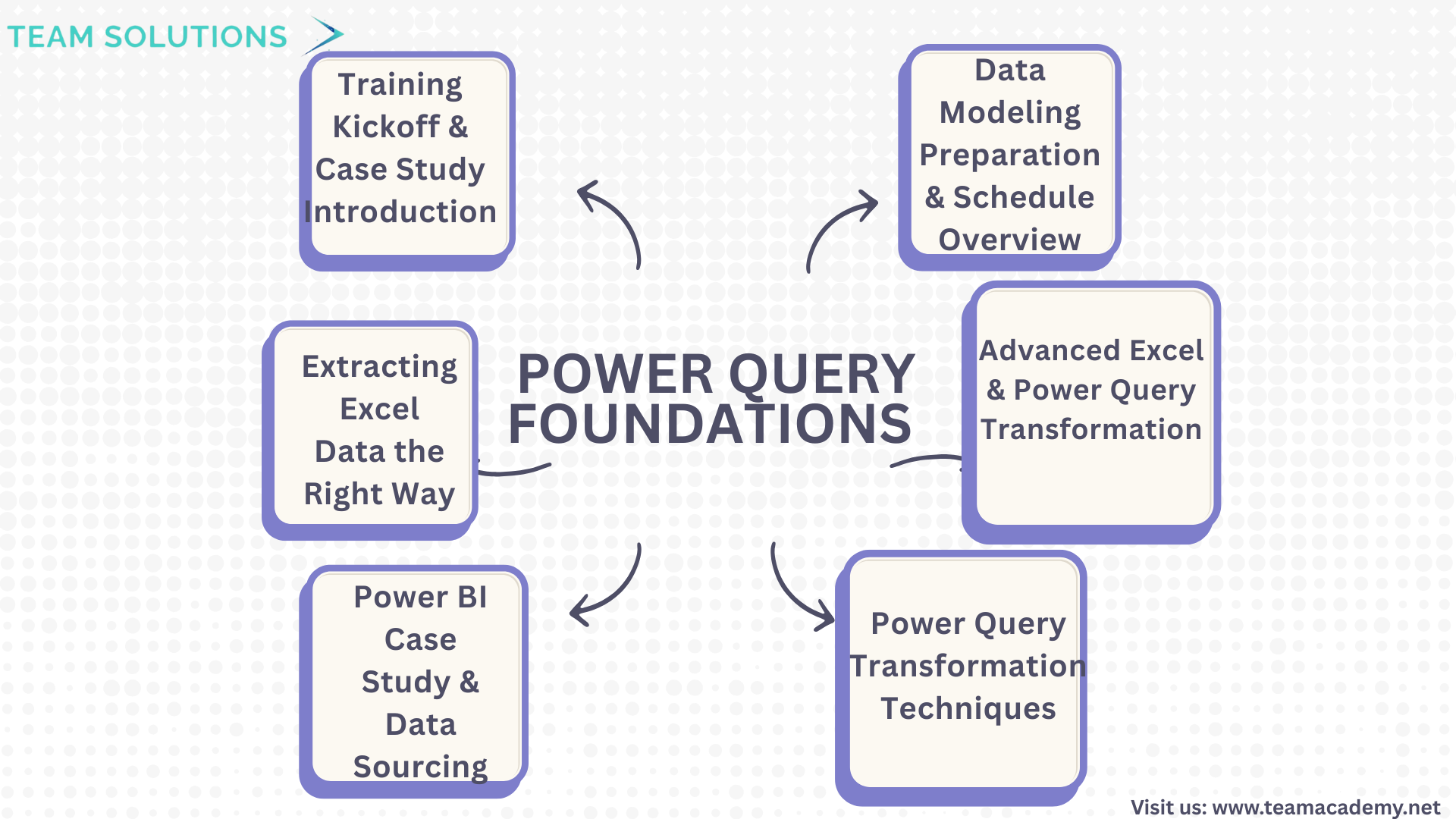
🔧 Training Kickoff & Case Study Introduction
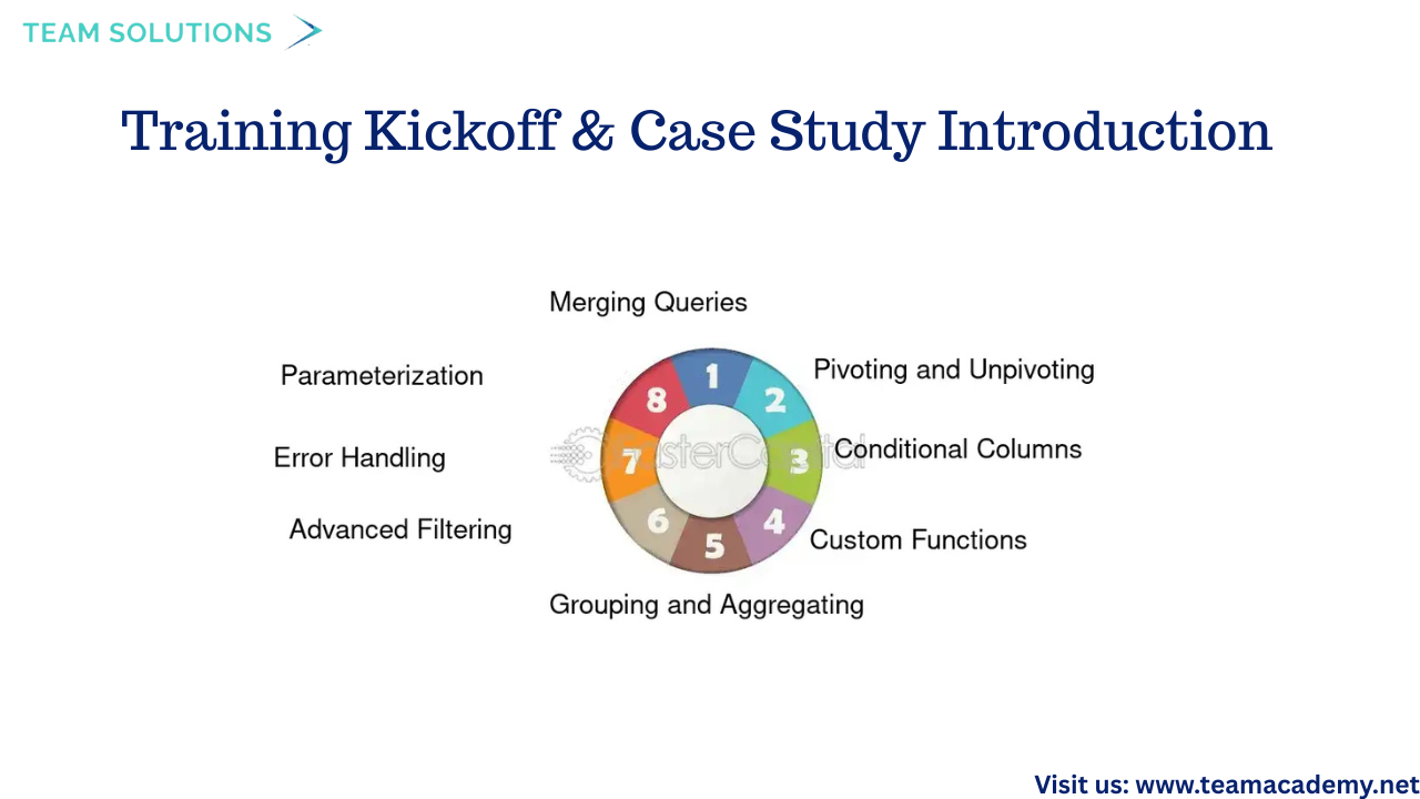
The session began with a technical setup to confirm smooth audio and video connectivity. Participants were introduced to the Northwind Traders Excel folder case study, which will be used consistently throughout the training program to demonstrate Power Query concepts in a structured and practical manner.
Key Power Query concepts introduced included:
🔗 Group By operations
➕ Append queries
🔀 Merge queries
🔄 Pivot & Unpivot techniques
The session was recorded, allowing learners to revisit the content and reinforce their understanding at any time.
📁 Extracting Excel Data the Right Way
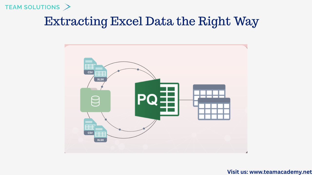
A major focus of the session was on best practices for working with Excel data in Power Query. Participants learned the importance of extracting specific tables instead of entire sheets to avoid unnecessary headers, footers, and manual cleanup.
Topics covered included:
📄 Appending multiple Excel files with identical column structures
➖ Performing simple calculations such as subtraction and grouping
📊 Importing only raw transactional data from folders
🧹 Avoiding summary tables during data extraction
This approach ensures cleaner datasets and more reliable analysis downstream.
📈 Power BI Case Study & Data Sourcing
The Northwind Traders case study was further explored to highlight how Power BI handles data differently from Excel. Participants learned how to:
📂 Import CSV files using Power Query
⚙️ Handle files with varying formats
🔍 Understand why Power BI offers more scalable and dynamic reporting
The session also included a demonstration on splitting text columns, setting the stage for more advanced transformation and modeling exercises.
🛠️ Power Query Transformation Techniques
Participants explored several powerful transformation features in Power Query, including:
✨ Formatting text (uppercase, proper case)
➕ Adding new columns using examples (without complex formulas)
🔢 Performing basic arithmetic calculations
❌ Handling errors and null values effectively
These demonstrations emphasized that Power Query can handle most advanced Excel operations, making it an essential skill for modern data professionals.
🔄 Advanced Excel & Power Query Transformations
The session also covered:
🔁 Transposing data (rows to columns and vice versa)
🧼 Removing special characters from CSV files
🔢 Replacing null values with zeros
📐 Performing statistical calculations such as minimum, mean, and multiplication
Sales-related calculations were demonstrated, including:
💰 Gross Sales = Unit Price × Quantity
📉 Net Sales = Gross Sales × (1 − Discount Rate)
These examples showed how Power Query simplifies complex transformations with repeatable, automated steps.
🧠 Data Modeling Preparation & Schedule Overview
To conclude, participants were briefed on the training schedule:
🗓️ January: Power Query and Data Modeling (with repeat sessions on Fridays)
📊 February: Data Visualization and reporting
Upcoming sessions will dive deeper into data modeling, DAX, and visualization best practices, building on the transformation skills learned in this class. Flexible attendance options were also shared, allowing participants to join either weekday or weekend sessions.
🌟 Final Thoughts
This session laid a strong foundation for working with Power Query and Power BI by emphasizing clean data, efficient transformations, and scalable reporting techniques. With hands-on case studies and real-world examples, participants are now well-prepared to progress into advanced data modeling and visualization topics.
📌 The next session will focus on data modeling and DAX—bringing transformed data to life through meaningful insights.
📊 Power BI Fundamentals: Data Extraction, Transformation & Visualization 🚀
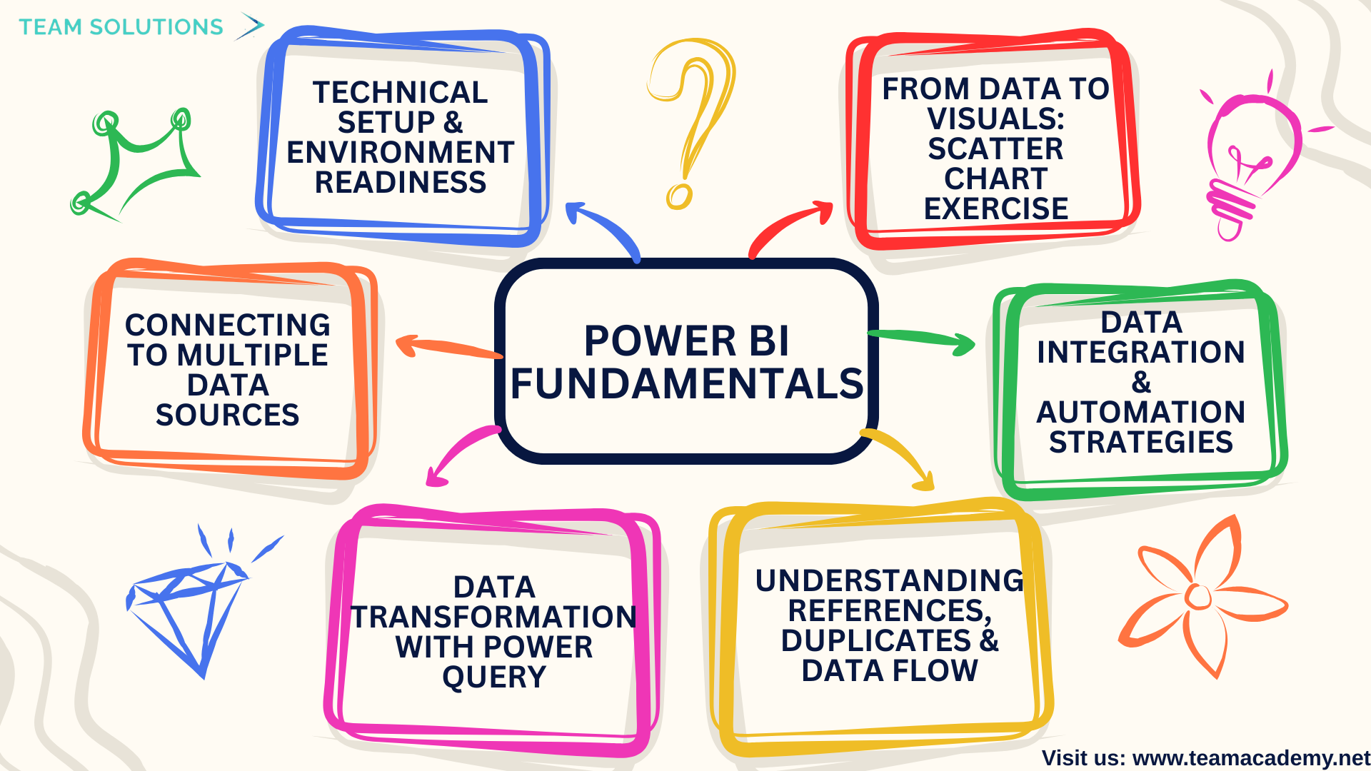
This session introduced learners to the core fundamentals of Power BI, with a strong emphasis on data extraction, transformation, and basic visualization techniques. The focus was on building a solid foundation for working with real-world datasets using Power Query, enabling participants to confidently move from raw data to meaningful insights.
🔧 Technical Setup & Environment Readiness
The session began with a technical setup walkthrough, ensuring all participants had:
✅ The correct version of Power BI Desktop installed
📁 Access to the practice datasets
📦 Proper extraction of downloaded files
A key concept highlighted early was Power BI’s philosophy of working with tables and structured data, rather than individual Excel cells—an essential mindset shift for effective BI development.
🔌 Connecting to Multiple Data Sources
Participants explored how Power BI connects to a wide range of data sources, including:
📊 Excel workbooks and folders
🗂️ Shared OneDrive directories
🗄️ Databases and cloud platforms
The importance of choosing the right data source (tables vs sheets) was emphasized to avoid data inconsistencies and transformation errors.
🔄 Data Transformation with Power Query
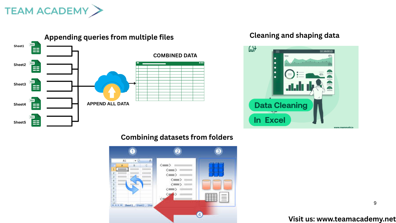
A major part of the session focused on Power Query, the engine behind data preparation in Power BI. Learners practiced:
🧹 Cleaning and shaping data
➕ Appending queries from multiple files
🔗 Combining datasets from folders
🧠 Managing data types and metadata
⚠️ Identifying and handling errors
The difference between duplicating queries and referencing queries was clearly explained, helping participants understand performance optimization and dependency management.
🧩 Understanding References, Duplicates & Data Flow
Participants learned:
📌 Duplicates create independent copies of queries
🔁 References remain linked to the original query and update automatically
They also explored how Power BI behaves as a data receptor, meaning source changes require manual refreshes rather than automatic updates.
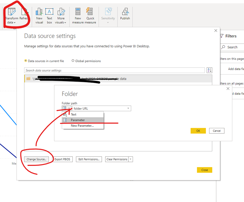
☁️ Data Integration & Automation Strategies
The session covered practical approaches to:
📁 Automate weekly and monthly reports using shared folders
🔄 Refresh datasets with minimal manual effort
🏗️ Understand data maturity levels—from Excel-based workflows to data warehousing
Cloud concepts like DirectQuery were introduced as preferred solutions for handling large datasets efficiently.
📈 From Data to Visuals: Scatter Chart Exercise
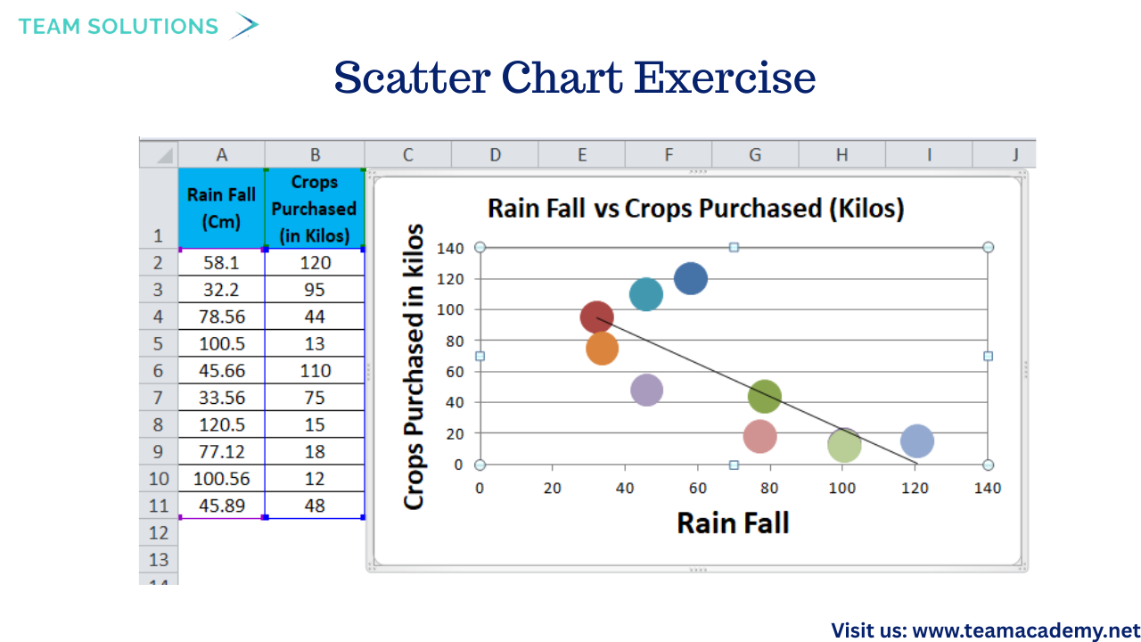
To conclude, participants applied their learning in a hands-on exercise:
📊 Transformed data was visualized using scatter charts
🔄 Data refresh and source updates were tested
🛠️ Common visualization issues were identified and resolved
Despite minor technical challenges during screen sharing, learners successfully connected data preparation with visualization outcomes.
🎯 Key Takeaways
Power Query is the backbone of clean, scalable Power BI reports
Structured data and templates save time and reduce errors
Automation and folder-based reporting enable real-time insights
Visualization becomes easier when data is properly prepared
🚀 Agile Project Management Explained: A Practical Guide for PMP Aspirants 🧠
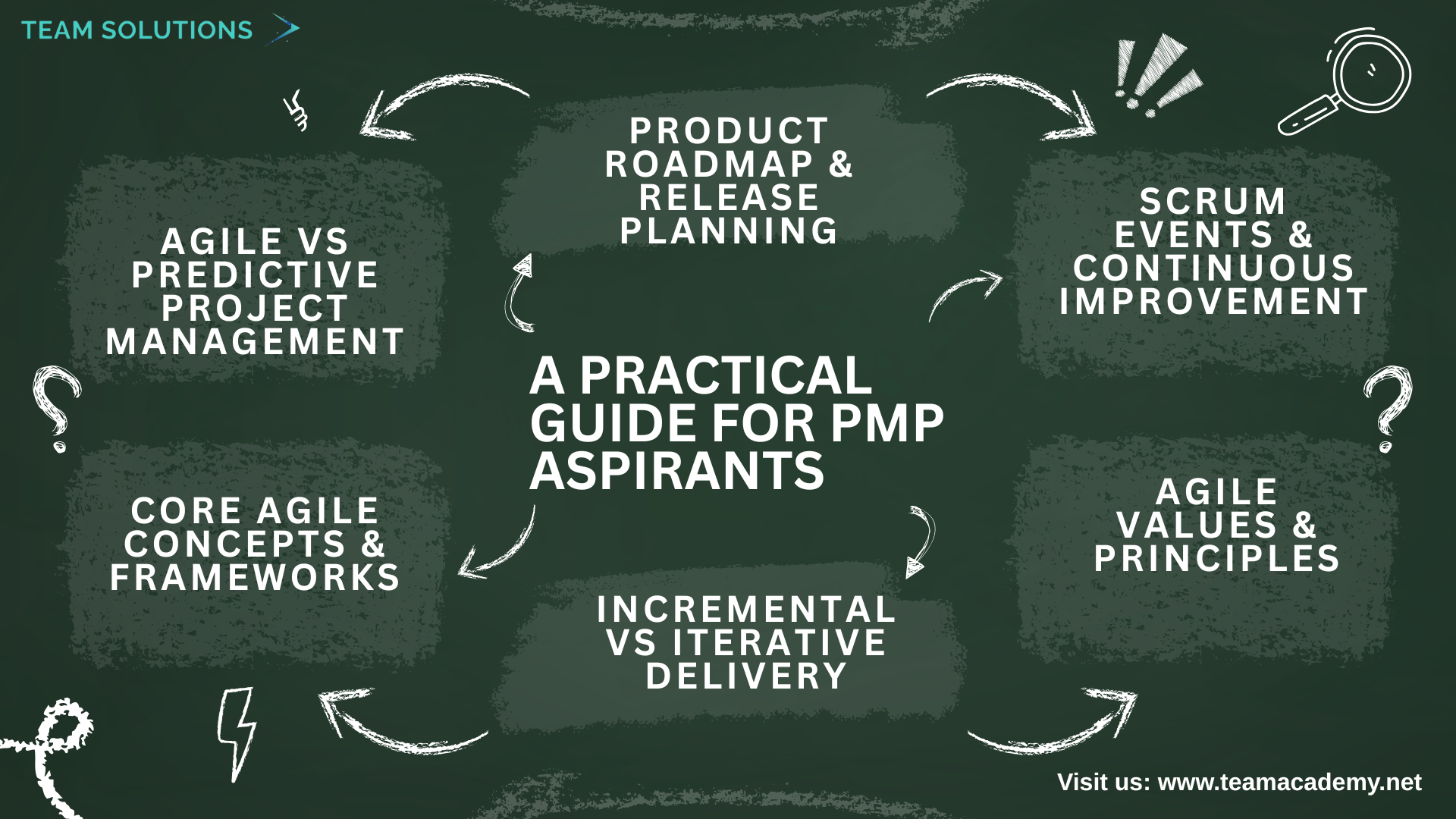
This session provided a comprehensive introduction to Agile Project Management, with a strong focus on Scrum as part of PMP exam preparation. Participants explored how Agile differs from traditional project management and learned how iterative delivery, collaboration, and continuous feedback drive successful project outcomes.
🔄 Agile vs Predictive Project Management
A key discussion point was the difference between predictive (Waterfall) and Agile lifecycles:
📐 Predictive projects have fixed scope, time, and cost
🔁 Agile projects fix time and cost while allowing scope to evolve
Agile emphasizes flexibility, early delivery, and responsiveness to change—making it ideal for projects with uncertainty or evolving requirements.
🧩 Core Agile Concepts & Frameworks
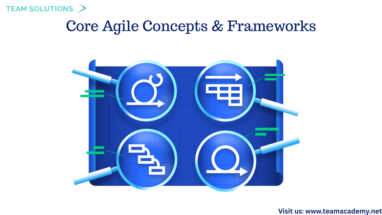
Participants were introduced to Agile frameworks such as:
Scrum
Kanban
Lean
Hybrid approaches
Agile teams are:
👥 Self-organized
🔧 Cross-functional
📏 Ideally 6–9 members (maximum 12)
Work is delivered in short sprints (up to 4 weeks), enabling frequent feedback and faster value delivery.
🔁 Incremental vs Iterative Delivery
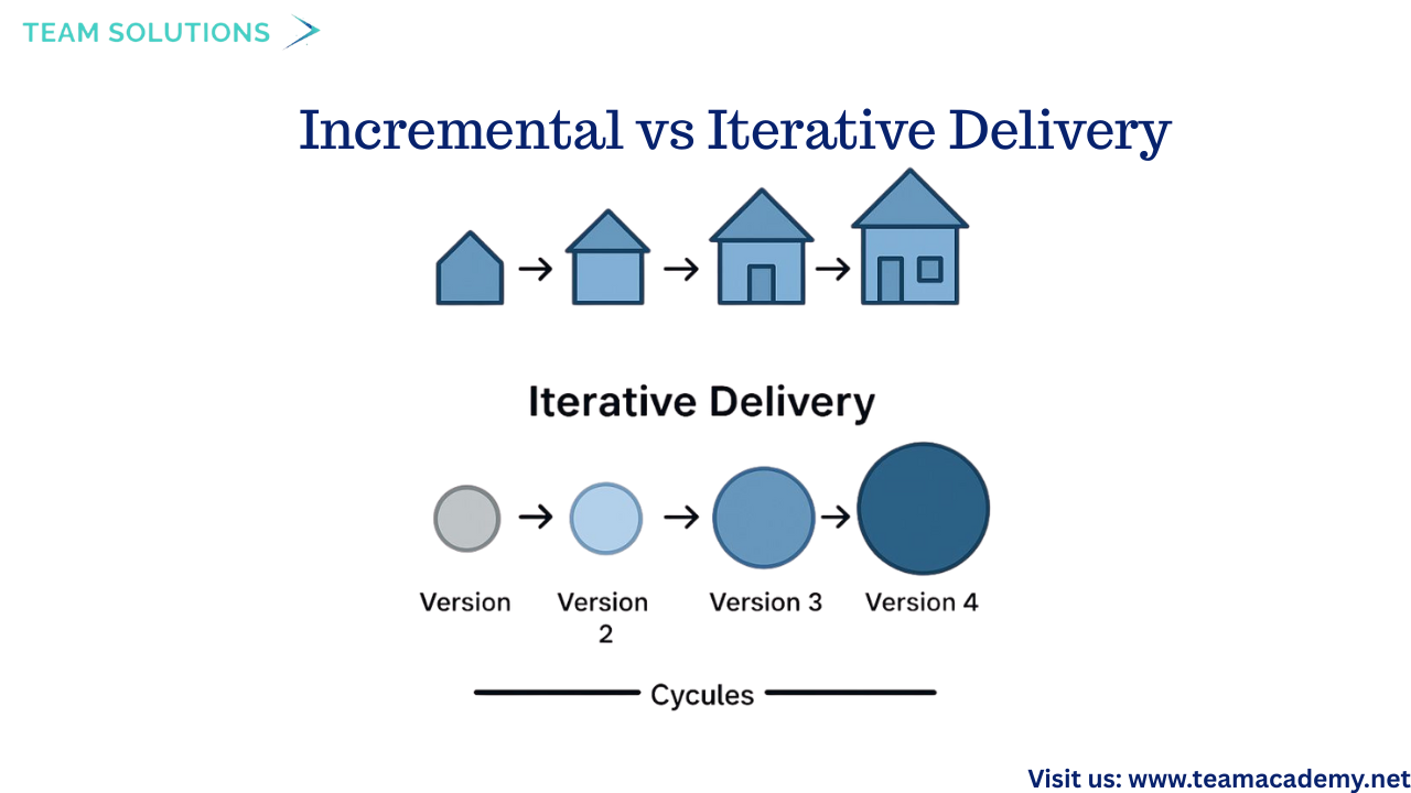
Two important Agile delivery approaches were explained:
➕ Incremental: Delivers usable parts of the product continuously
🔄 Iterative: Improves the product through repeated cycles
High-value items are always prioritized and delivered early to maximize stakeholder satisfaction.
💡 Agile Values & Principles
The session reviewed the 4 Agile Values:
👤 Individuals and interactions over processes and tools
💻 Working solutions over extensive documentation
🤝 Customer collaboration over contract negotiation
🔄 Responding to change over following a fixed plan
It also covered key Agile principles, including:
Early and continuous delivery
Embracing change
Frequent feedback
Sustainable pace
Continuous improvement through reflection
👥 Agile Roles & Responsibilities
Three key Scrum roles were discussed:
🎯 Product Owner – Manages the product backlog and maximizes business value
🛠️ Development Team – Builds and delivers the product increment
🧭 Scrum Master – Servant leader who facilitates Agile practices and removes obstacles
🗂️ Backlogs, User Stories & Planning
Participants learned how Agile work is organized using:
📋 Product Backlog – A dynamic list of prioritized user stories
📦 Sprint Backlog – Work committed by the team for a specific sprint
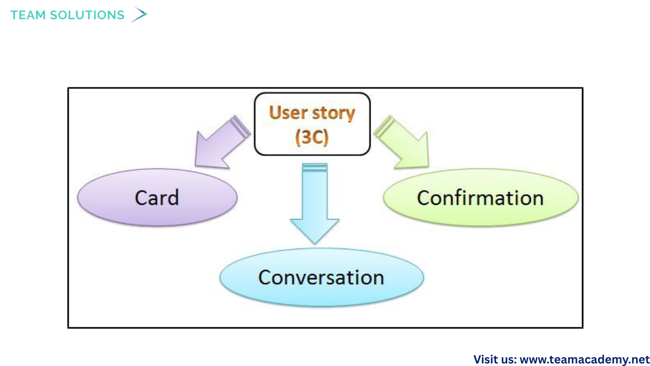
User stories follow:
✅ INVEST model
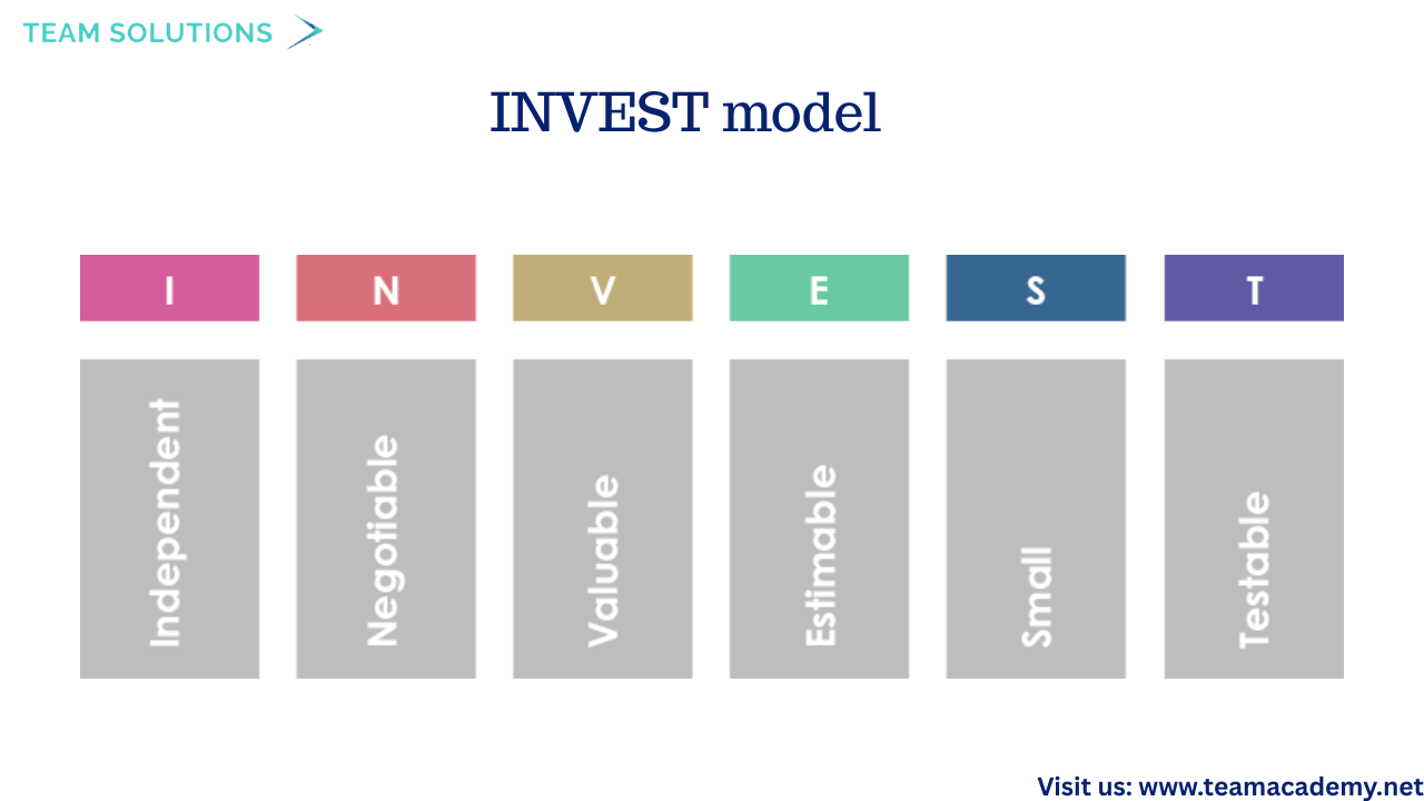
🧾 3Cs: Card, Conversation, Confirmation
🗓️ Scrum Events & Continuous Improvement
The four core Scrum events were explained:
🧠 Sprint Planning – Decide what to build next
⏱️ Daily Stand-up – 15-minute progress check
👀 Sprint Review – Demonstrate work and collect feedback
🔍 Sprint Retrospective – Improve processes and teamwork
The retrospective was highlighted as the key improvement event in Agile.
🗺️ Product Roadmap & Release Planning
Before creating the backlog, a product roadmap is developed to outline:
Release timelines
Business goals
High-level features
Agile release planning ensures alignment between stakeholders and delivery teams while allowing flexibility.
📊 Transparency & Information Radiators
Agile promotes transparency through:
📌 Information radiators
Visual boards
Real-time status updates
These tools help stakeholders track progress and support informed decision-making.
🎓 Key Takeaways for PMP Aspirants
Agile focuses on value, speed, and adaptability 🚀
Collaboration and feedback drive better outcomes 🤝
Understanding Agile concepts is essential for PMP success 🏆
Exam questions often mix Agile, predictive, and hybrid scenarios 🧠
This session provided a strong foundation in Agile thinking, helping participants connect theory with real-world project delivery and PMP exam expectations.
📌 Practice smart, think like a project manager, and success will follow!
👉 Join our Free Demo Class
👉 Enroll in our Project Management Programs to master predictive, Agile, and hybrid approaches.
👉 Explore now to deepen your skills and stay ahead in your career
🏥 Leadership, Quality & Strategy in Healthcare: Building High-Impact Organizations 🌟
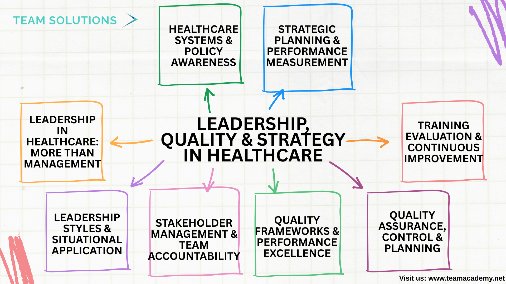
The fifth session focused on the critical role of leadership and quality integration in healthcare organizations, highlighting how effective leadership drives patient safety, compliance, and continuous improvement. Participants explored leadership styles, quality frameworks, stakeholder engagement, and strategic planning tools essential for healthcare quality professionals.
👩⚕️ Leadership in Healthcare: More Than Management
A key theme of the session was the difference between leadership and management:
Management focuses on planning, organizing, and controlling tasks 📋
Leadership focuses on inspiring, motivating, and influencing people 🌱
It was emphasized that not all managers are leaders, and strong leadership is essential for navigating complex healthcare environments.
🧭 Leadership Styles & Situational Application
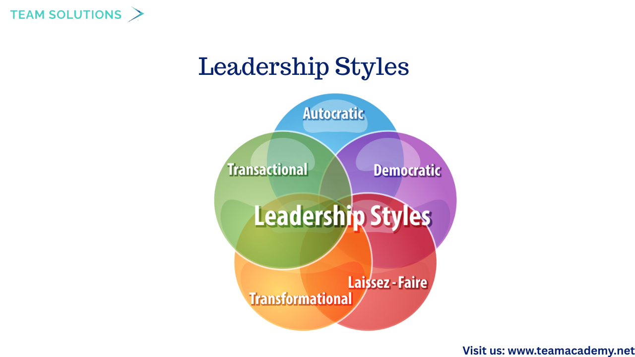
Participants explored multiple leadership styles and their relevance in healthcare:
🤝 Democratic leadership – Encourages team participation
🛑 Autocratic leadership – Useful in emergencies or crisis situations
🎯 Strategic leadership – Aligns operations with long-term goals
🔄 Transformational leadership – Drives innovation and cultural change
The importance of situational leadership—adapting leadership style based on context, team maturity, and organizational needs—was strongly emphasized.
🤝 Stakeholder Management & Team Accountability
Effective stakeholder engagement was highlighted as a cornerstone of successful healthcare projects. Participants learned to:
Identify internal and external stakeholders
Analyze stakeholder interest, influence, and impact
Communicate effectively to avoid risks and misunderstandings
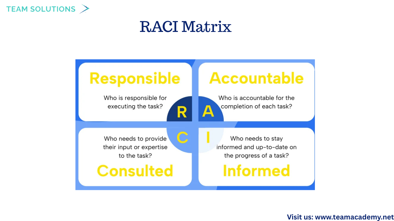
Tools introduced included:
🧩 RACI Matrix (Responsible, Accountable, Consulted, Informed)
⏳ Eisenhower Matrix for prioritizing urgent vs important tasks
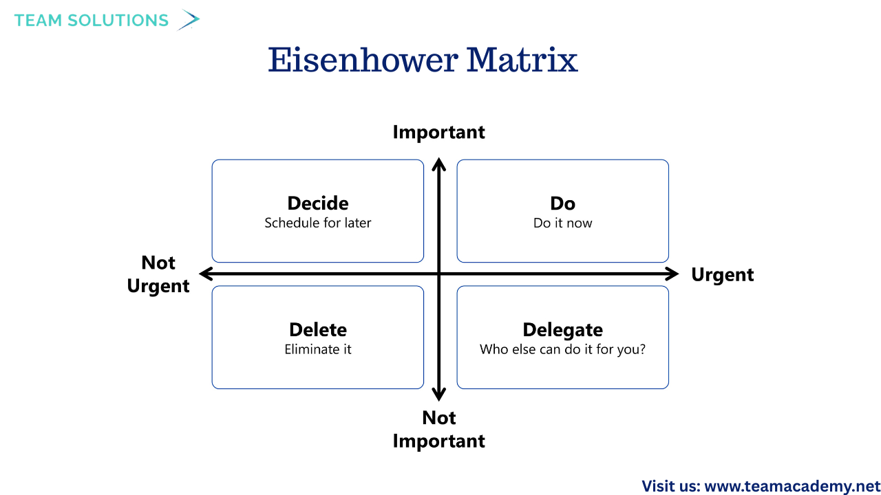
These tools help prevent burnout while ensuring accountability and clarity.
📊 Quality Frameworks & Performance Excellence
The session introduced globally recognized quality frameworks, including:
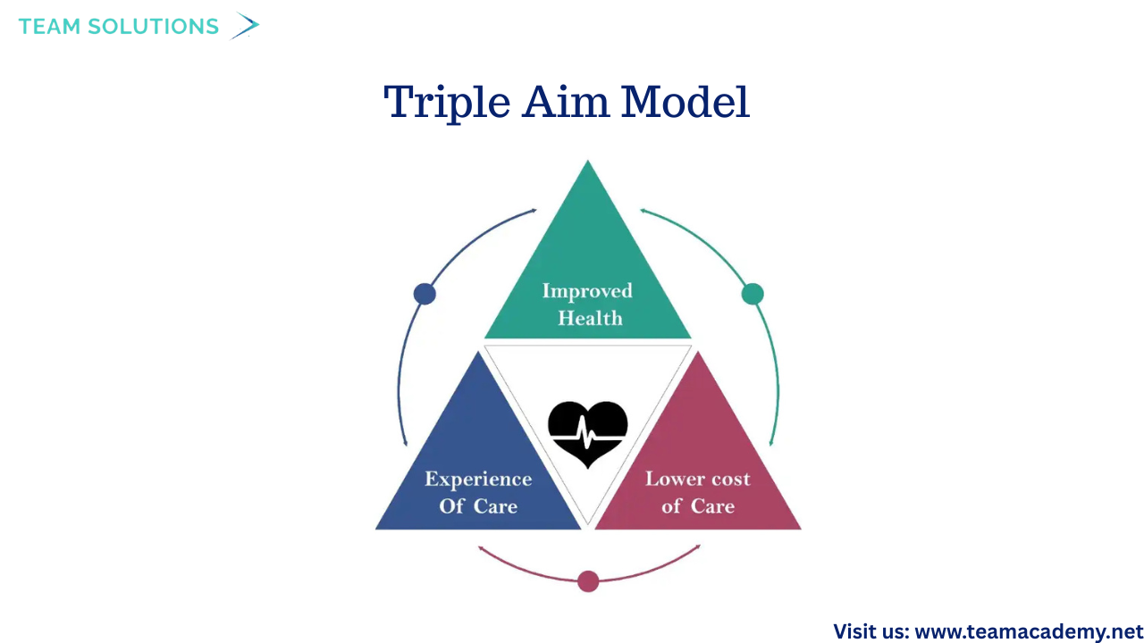
🏆 Baldrige Performance Excellence Framework
🎯 Triple Aim Model – Improving population health, enhancing patient experience, and reducing cost
Participants discussed the shift from volume-based care to value-based care, emphasizing community engagement and cross-functional collaboration.
🧪 Quality Assurance, Control & Planning
Healthcare quality professionals play a vital role in maintaining standards through:
✔️ Quality Assurance (QA) – Ensuring processes meet standards
🔍 Quality Control (QC) – Monitoring outcomes and correcting defects
🗺️ Quality Planning – Designing systems to deliver consistent care
The session also covered compliance with:
Clinical practice guidelines
Documentation standards
Practitioner performance evaluations
🎓 Training Evaluation & Continuous Improvement
Participants were introduced to Kirkpatrick’s Four Levels of Training Evaluation:
Reaction 😊
Learning 📚
Behavior 🔄
Results 📈
This model helps quality teams assess the effectiveness of training programs and ensure real-world impact.
🧠 Strategic Planning & Performance Measurement
Strategic planning concepts included:
🧩 Defining goals and objectives
🔍 Environmental assessment
🤝 Stakeholder engagement
📈 Evaluation and improvement
Key tools discussed:
SWOT Analysis (Strengths, Weaknesses, Opportunities, Threats)
-
Balanced Scorecard measuring:
Financial performance 💰
Internal processes ⚙️
Customer satisfaction 😊
Learning and growth 🌱
🏥 Healthcare Systems & Policy Awareness
The session concluded with an overview of Medicare and Medicaid, explaining their differences and why understanding them is important for healthcare quality professionals—especially in areas like compliance, reimbursement, and pay-for-performance models.
🌟 Key Takeaways
Leadership is essential for healthcare quality and safety 🏥
Effective leaders adapt styles based on situations 🔄
Quality professionals bridge strategy, compliance, and performance 📊
Continuous improvement requires strong frameworks and stakeholder engagement 🤝
This session reinforced how leadership excellence and quality management work together to create safer, more effective, and patient-centered healthcare systems. 🌍💙
👉 Join our Free Demo Class and start your journey toward becoming a certified healthcare quality professional!
👉 Enroll in our Certified Professional in Healthcare Quality (CPHQ) preparation course to level up your career.
👉 Explore Now and start transforming your healthcare practice today
Need assistance with power query file source change
My question is if I have 5 to 6 files and I need to change their sources in one go instead of changing each file's source separately and all the files are in the same source of folder. How to do it?