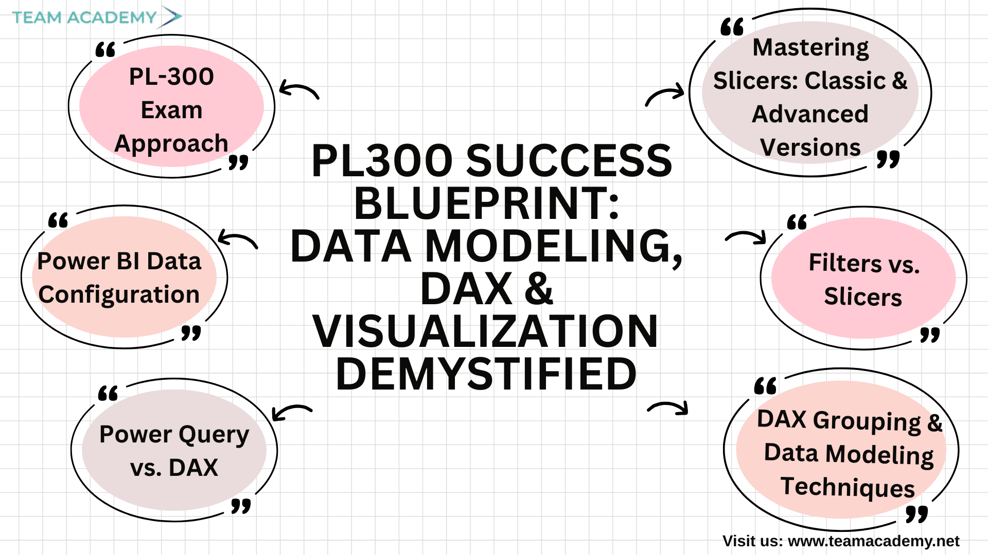
📊 🎯 PL300 Success Blueprint: Data Modeling, DAX & Visualization Demystified🚀
Preparing for the PL-300 exam is not just about learning Power BI—it’s about mastering the mindset, techniques, and workflows used by real data analysts. In this session, the team explored essential Power BI concepts that go far beyond the basics, focusing on how to solve problems independently, build clean data models, and create polished, professional dashboards that stand out in the workplace and in the exam.
⭐ PL-300 Exam Approach: Learn Smart, Practice Smarter
The session began with an overview of the PL-300 exam, emphasizing structured problem-solving. Participants were encouraged to attempt foundational tasks independently before seeking help with advanced concepts. This approach mirrors real data analytics work: you learn by doing.
They also explored how to enable Power BI preview features, customize report themes, and insert company logos—key skills to deliver visually consistent and professional dashboards.
⚙️ Power BI Data Configuration: Understanding the Backbone of Your Data
A crucial part of the discussion revolved around data types, summarization options, and the difference between implicit and explicit measures.
🔹 Implicit measures → Automatically generated by Power BI
🔹 Explicit measures → Created through DAX for more control
This led to the introduction of Data Analysis Expressions (DAX)—the language that transforms Power BI from a visual tool into an analytical powerhouse.
🧮 Power Query vs. DAX: When to Use What?
The team explored the differences between calculations created in Power Query versus those created in Power BI:
Power Query Power BI (DAX)
Best for data cleaning & transformation Best for dynamic calculations
Runs before the data model loads Calculates values on the fly
No relationship awareness Fully relationship-aware
They also learned when to use merge, append, and relationships, which is critical for minimizing redundancy and improving report performance.
📁 DAX Grouping & Data Modeling Techniques
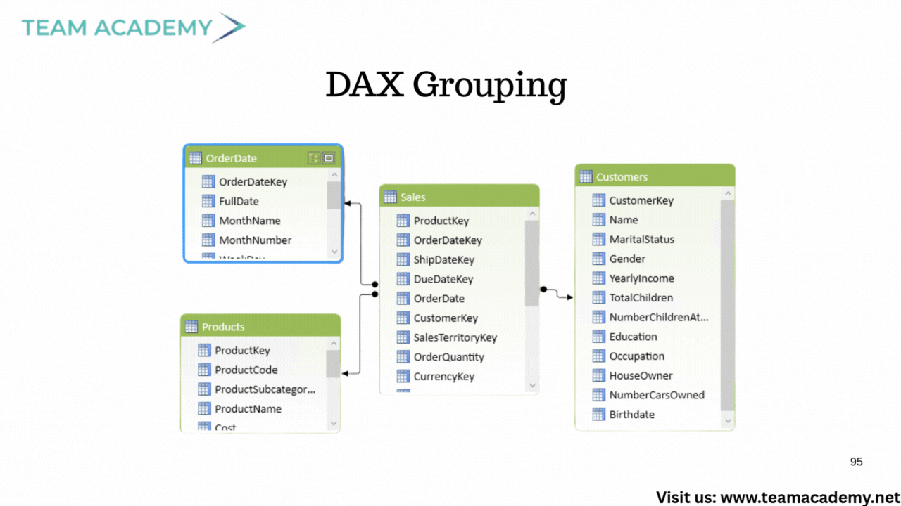
Participants practiced creating custom groups such as:
Must-Have
Should-Have
Could-Have
They also learned how to regroup items, classify categories, and build filters that enable tailored analysis—skills frequently tested in PL-300 scenarios.
🎛️ Filters vs. Slicers: What’s the Real Difference?
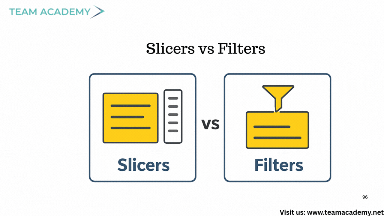
A core topic was understanding how filters and slicers operate:
✔️ Filters
Used to exclude or restrict data — applied at visual, page, or report level.
✔️ Slicers
Used to highlight and explore data interactively — perfect for user-driven dashboards.
This clarity helped the team grasp how dashboards can remain clean, consistent, and insightful.
📈 Visualization & Dashboard Layout Skills
The team practiced creating a year-over-year (YOY) dashboard showcasing:
Total revenue
YOY variance
Category breakdowns
They also explored responsiveness in published dashboards, ensuring reports adapt seamlessly across devices.
🔘 Mastering Slicers: Classic & Advanced Versions
A major highlight was the new button slicer, allowing:
Multiple button layouts
Category segmentation
Enhanced navigation
Potentially images per category
Participants were challenged to create a slicer displaying different images for items like beverages, condiments, and dairy products—an advanced skill that elevates dashboard design.
🖼️ Category Image Integration
To prepare for visually rich dashboards, the team learned to use:
Category IDs
Category names
SVG image URLs
Power BI’s built-in icon library (12,000+ SVGs!) was used to generate category-specific images, allowing dashboards to become more intuitive and appealing.
🧪 Upcoming Assignments & Practice Datasets
Two datasets were assigned for hands-on modeling and visualization:
🏥 Hospital Records
✈️ Airline Flight Delays
Participants were asked to model the data and prepare dashboards for the next class, reinforcing their mastery of PL-300 concepts.
🎨 Visualization Design Mastery
The session wrapped up with advanced topics such as:
Card slicers
Layout optimization
Integrating images
Line charts with reference labels
Dashboard storytelling techniques
The group was reminded that clarity + creativity = professional-level dashboards.
🗓️ What’s Next?
Upcoming classes will continue every Friday at 2 PM, focusing on:
Dashboard publishing
Performance optimization
Visualization techniques
End-to-end report walkthroughs
This ensures every participant not only passes the PL-300 but also builds real-world Power BI expertise.
From data modeling to visual storytelling, this session equipped the team with exam-ready skills and workplace-ready techniques. With consistent practice and the right mindset, anyone can excel at Power BI and succeed in the PL-300 exam.